Please note: If on devices you click on links to images and/or text that do not open if they should, just slightly scroll the screen to re-enable the function. Strange behavior of WordPress.
Laying down the foundations of a new plastic space
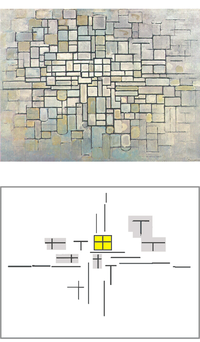
On the previous page I showed four compositional layouts that will guide the paintings Mondrian would develop after 1915 and up to 1942:
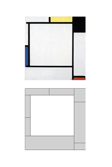
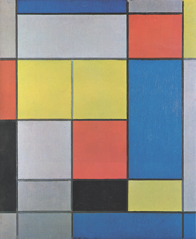
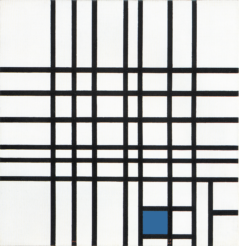
Layout A: A square proportion is placed in unstable balance by a surrounding asymmetrical set of different sizes, proportions, and colors.
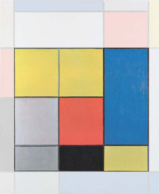
Layout B: A square emerging from the relationship between the two horizontal lines and the two vertical sides of the canvas is crossed by a vertical line:
1920-22
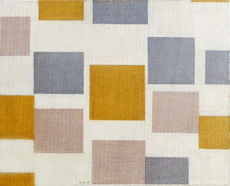
1925-28
1928-32
1929-32
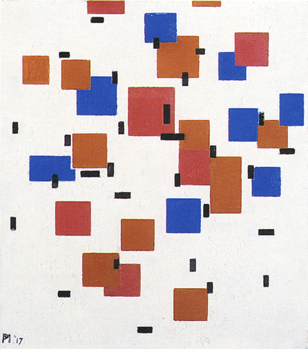
In layout C the square is reduced in size, leaving room for three large areas nearing the proportions of squares which, however remain open and therefore appear undefined; same as in Pier and Ocean 5, with a fully achieved square and a number of unachieved squares.
In layout D, the square duplicates and remains open appearing once small in blue and once larger in red.
Before going into a detailed explanation of these works, I would like to briefly illustrate their substantive meaning that stems from Pier and Ocean 5. In fact, all the works Mondrian made between 1916 and 1942 show profound continuity with the 1915 work.
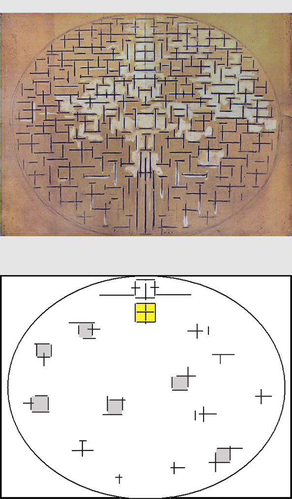
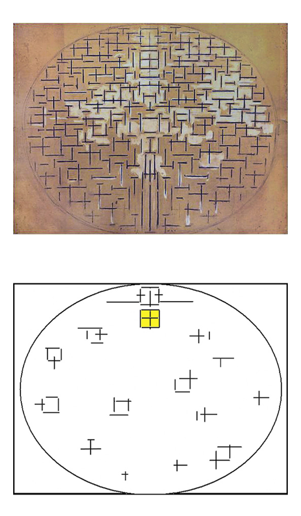
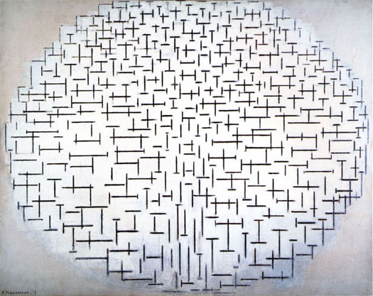
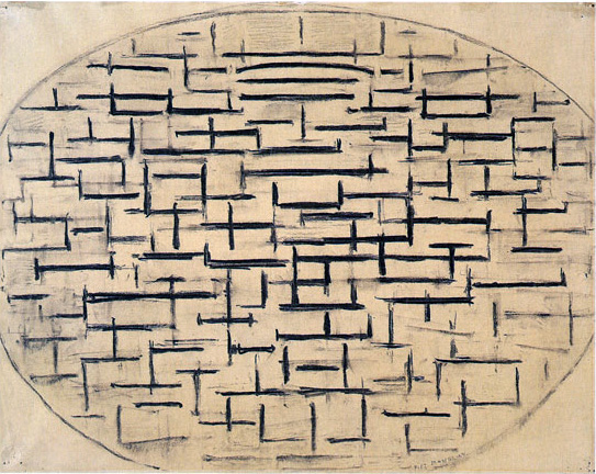
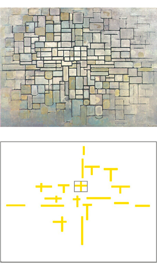
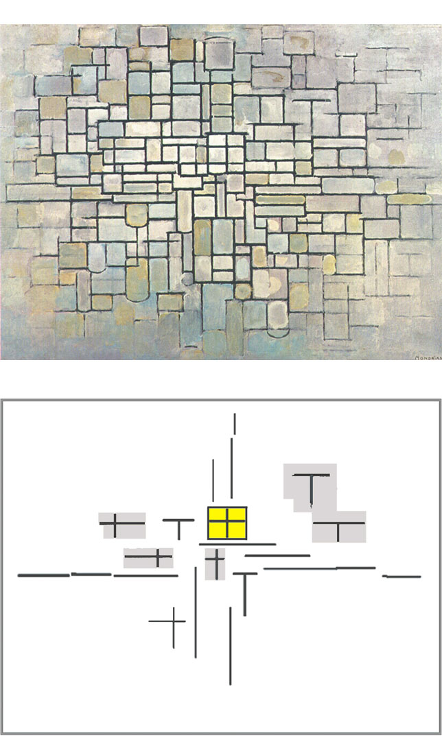
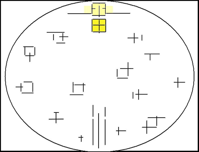
In Pier and Ocean 5 (Fig. 1) we have seen how a variety of shifting interactions between horizontal and vertical dashes achieve a balanced synthesis in a square proportion. We have also seen how this square becomes a second one higher-up that splits into a duality which flows back toward the ever-changing, imbalanced relationships between opposites; the unity reached in the first square reopens to multiplicity with the second square:
Pier and Ocean 5, 1915
Diagram
Moreover, Pier and Ocean 5 shows potential squares, which do not attain the balance of the one in the center. The coexistence of a constant condition (the central square) with a variety of imbalanced and ever changing situations (the unachieved squares) reminds us of how during our existence we often search for stable living conditions and unity of our being that we fail to achieve completely always contended, as we are, between opposite impulses.
This dialectic between an ideal balance and a variety of unbalanced situations, that is, between the constant and the mutable, the one and the manifold will be, in ever-changing form, the guiding thread of all Mondrian’s subsequent work.
We shall now have a glance at this long process using for the moment only ten paintings that Mondrian made between 1915 and 1942. A detailed examination of the process starts lower on this page and continues on four additional pages following this one.
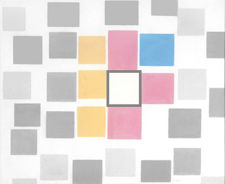
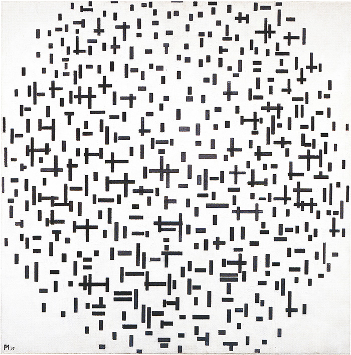
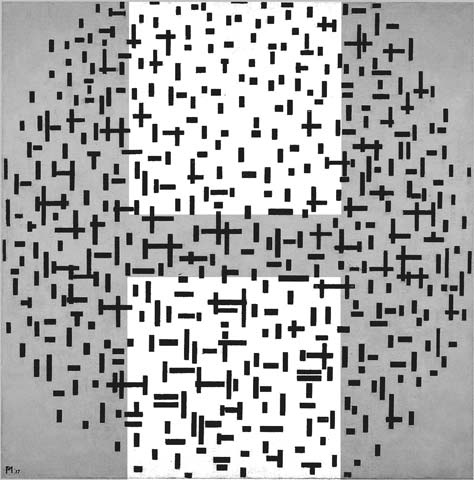
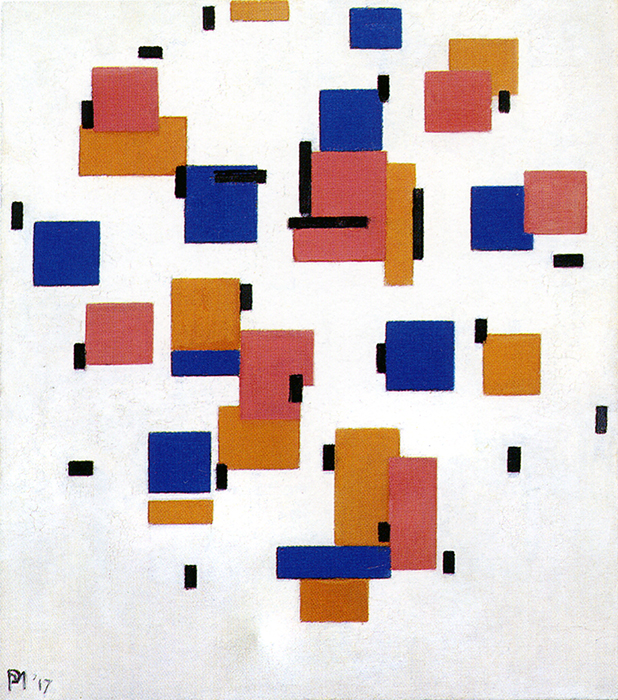
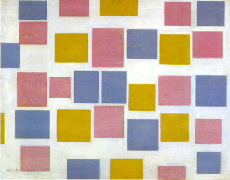
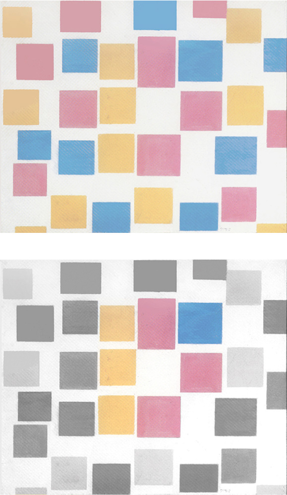
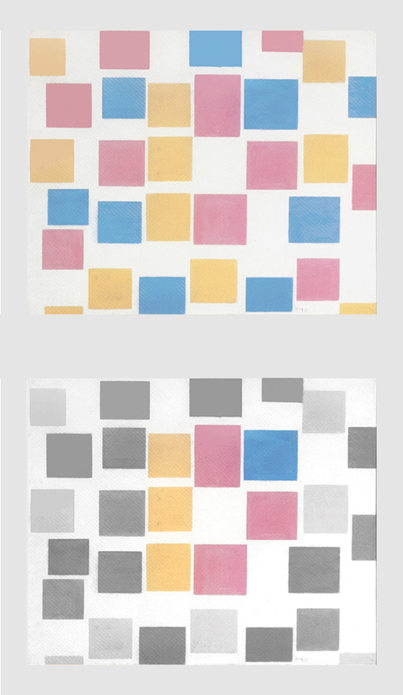
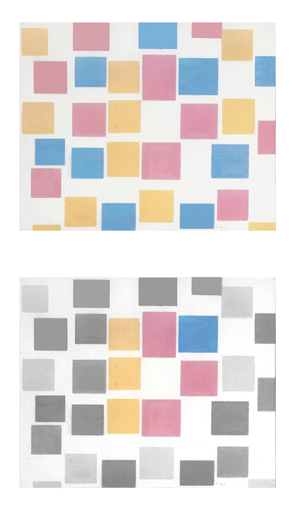
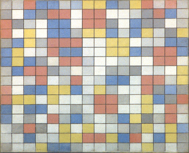
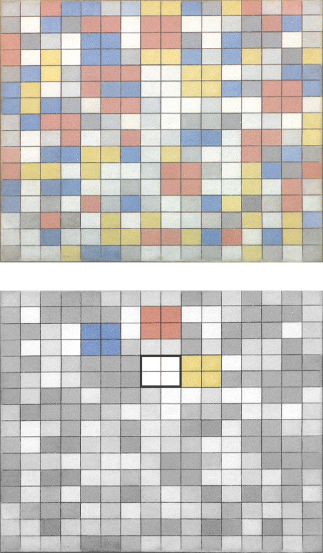
Fig. 2: The graphic structure made of small black dashes we see in Fig. 1 becomes here a set of differently colored planes of varying sizes and of proportions almost always close to those of squares. These can be read as the development and variation of an ideal square that changes in size, proportion and color to suggest a manifold and variable space.
This was implicit in Pier and Ocean 5 (Fig. 1) where, after balancing a multiplicity of unbalanced signs, the central square reopens to manifold space which is what we now see in Fig. 2. Interestingly enough we note a white area of square proportions in the center of Fig. 2 that recalls the central square in Fig. 1:
Composition with Color Planes 2, 1917
Diagram
Years later the artist said that in these works the planes floated freely in space and the whole composition lacked cohesion. “Feeling the lack of unity, I grouped the rectangles together.” (Mondrian, 1943).
The painter works now to express in a new form the sense of unity evoked in Fig. 1 with a single central square that was lost in the transition to Fig. 2.
Why does Mondrian care so much about the relationship between multiple and one? I remember the example of a tree which appears as a synthetic point seen from a distance, then as a complex reality if observed from very close and then again as a tiny point when we move away from it again.
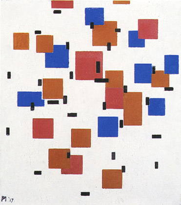
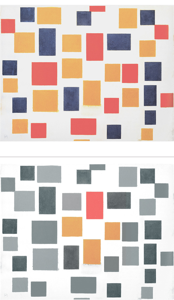
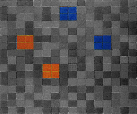
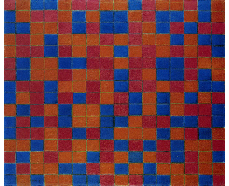
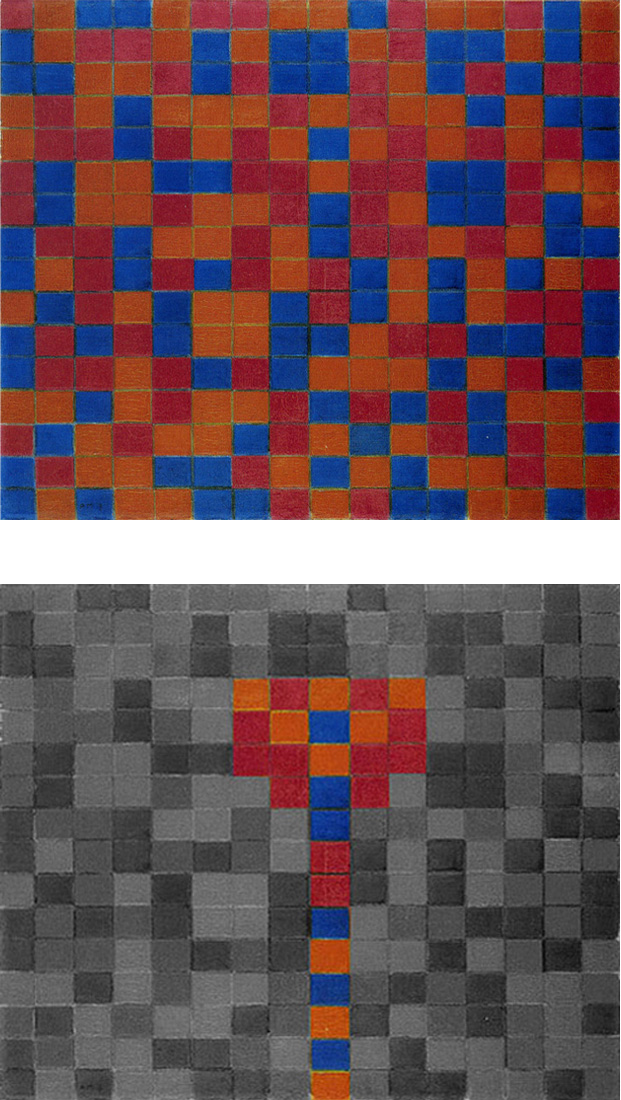
The scattered planes of Fig. 2 come together in Fig. 3 generating lines between the planes. Three squares of the same size, one blue, one magenta and one yellow, form a compact and regular layout which suggests constancy and unity if compared with other parts of the composition where forms suddenly change:
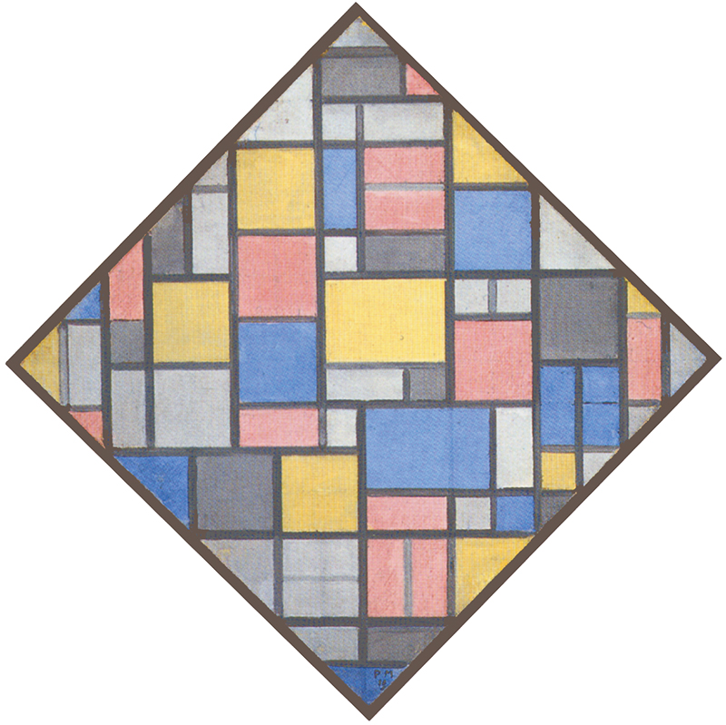
Lozenge Composition, 1919
Diagram
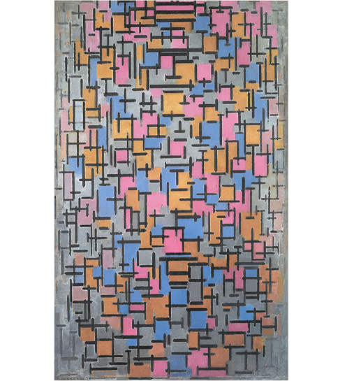
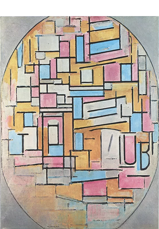
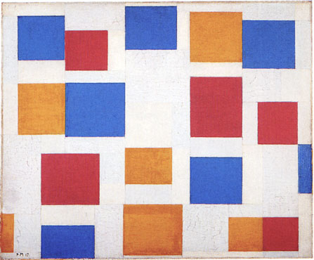
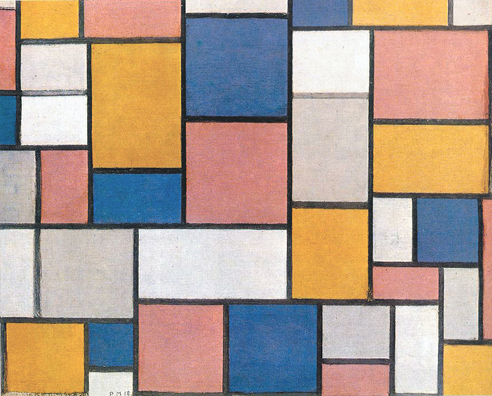
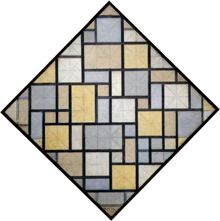
The solution of three superimposed squares however does not satisfy Mondrian since he needs to express unity through a single shape as in Fig. 1 and this is why in Fig. 4 the artist suggests a multiplicity of forms and colors concentrating into a large square proportion, that is, into a symbol for unity; a unity which, however, consists of a number of different parts. i.e., of multiplicity:
Composition B, 1920
Diagram
Fig. 4 expresses multiplicity as one and unity as an articulated set of different parts.
“The one seems to us to be only a one; in reality it too is a duality, a whole. Each thing shows in smallness again the whole. The microcosm is equal as composition to the macrocosm, says the sage. We have therefore only to consider each thing in itself, the one as a duality or multiplicity, as a whole. And inversely each element of a complex is to be seen as a part of that complex, as part of a whole.” (Mondrian)
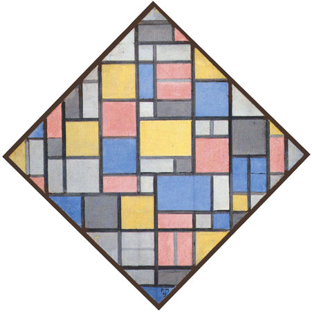
Because it is chromatically so heterogeneous, however, the large square which should express unity does not manifest itself with sufficient clarity in Fig. 4 and that’s why in a following canvas the square is purified of the composite aspect and turns into a more evident homogeneous white field defined by black lines (Fig. 5):
Composition with Yellow, Red, Black. Blue and Gray, 1920
Diagram
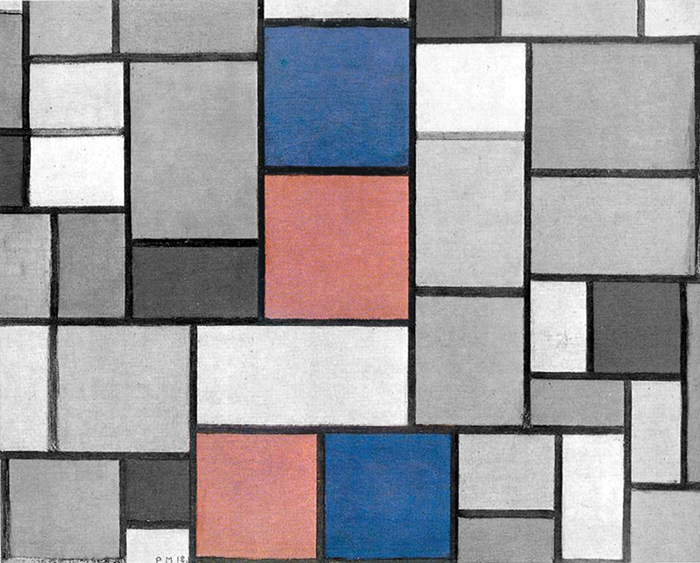
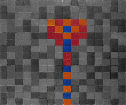
With Fig. 6 the artist again tries to express unity as articulated as possible with a large, self-imposing red square coexisting with three different squares (2, 3, 4) where horizontal (3) or vertical segments (4) compensate for the slightly vertical (3) and horizontal (49 proportions of the squares:
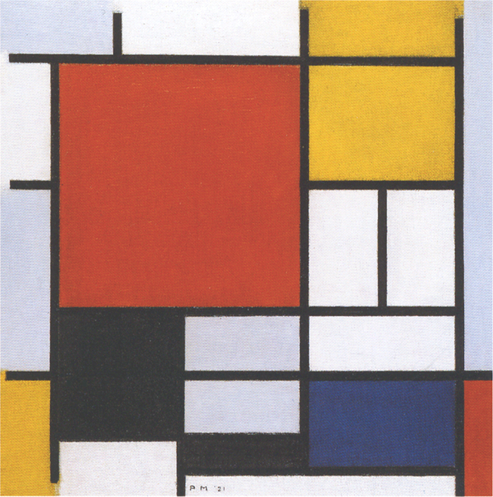
Composition with Large Red Plane, Yellow, Black, Gray and Blue, 1921
Diagram
We contemplate an interplay of opposite directions which find find a better balance in 1 and 2. Unity is expressed in four different ways.
This is typical of the artist’s way of proceeding: attaining a certain degree of synthesis and control (Fig. 5) and then opening up again to variability (Fig. 6) while always seeking to maintain a certain balance between the two aspects.
Fig. 7: The square reappears as a white field (as in Fig. 5) to open up again to variable sizes, proportions and colors (Fig. 8) as in Fig. 6:
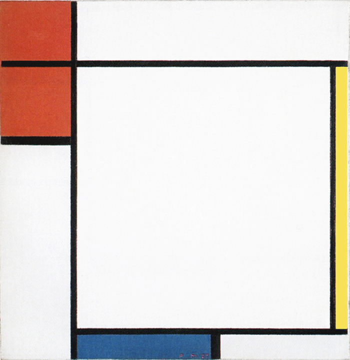
Composition with Red, Yellow and Blue, 1927
Composition en Rouge, Bleu et Jaune, 1930
Fig. 9: An increased number of lines generate a multiplicity of white fields among which we note squares that expand slightly horizontally or vertically. We contemplate here a dynamic square in the making.
Unity (a steady blue square) and multiplicity (a variable set of changing “almost squares”) merge together and this is reminiscent of Pier and Ocean 5 that Mondrian painted twenty-two years earlier which present in a sketchy form a relationship between one defined square and a sea of unachieved squares:
Composition N. 12 with Blue, 1937-42
Diagram
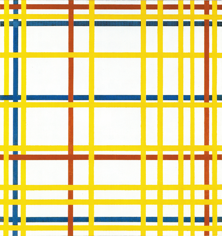
We see something similar in Fig. 10 where, however, everything is expressed in color. Mondrian seems to have been intent on combining the three colors so as to express not only a synthesis of horizontal and vertical (a square form) but of yellow, red, and blue at the same time, i.e., a unity of form and color:
New York City, 1942
Diagram
Pier and Ocean 5, 1915
Diagram
In all the above shown nine works the square of Fig. 1 opens up to change and at the same time can be glimpsed as such.
Between 1915 and 1942 the square module, first appeared in Fig. 1 is a constant feature but in a state of continuous evolution.
Every composition is a plastic symbol of the manifold and controversial space of reality, which attains measure and a harmonious condition in the space of consciousness (the balanced square) before opening up again to nature and life (the dynamic flow of perpendicular lines along with the unachieved squares and opposite rectangles of different sizes, proportions and colors which symbolize the variety of life).
The above has been in truth a long and laborious process involving a much larger number of paintings; I therefore had to divide its detailed explanation into five pages beginning with the present one and continuing with:
Neoplasticism 1 – 1919 – 1925
Neoplasticism 2 – 1925 – 1930
Neoplasticism 3 – 1930 – 1933
Neoplasticism 4 – 1934 – 1942
From the next paragraph on and on the mentioned four pages you will be able to find a detailed examination of what has been shown in the above synthesis.
A new plastic language
Between 1915 and 1919 Mondrian defines a new plastic language whose foundations were embryonically laid down during the previous cubist phase. Called Neoplasticism, this language will consist of straight perpendicular lines, segments and planes of color; a precise visual vocabulary whose purpose, nevertheless, is to express in clear form life in its contradictory and hazy aspects as well.
In 1915 Mondrian produced a new variation on the Pier and Ocean theme, which he called Composition 10 in Black and White (Fig. 1):
Charcoal, Ink (?) and Gouache on Paper,
cm. 87,9 x 111,7
Composition N. 10 in Black and White, 1915,
Oil on Canvas, cm. 85 x 108
Unlike the previous works drawn in charcoal or pencil on paper, this version is painted in oil on canvas, for which reason some scholars tend to regard it as the final work and the others as preparatory studies. It is true that this is a work of greater beauty in which texture and color are expressed with the utmost sincerity. I say color because even though the canvas is painted in black and gray, it is a superb gradation of grays that, as in certain Chinese paintings, become more brilliant and eloquent than colors in the literal sense. The original work glows with a magical light.
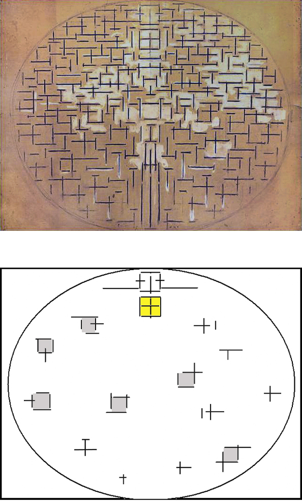
The compositional layout is similar to Pier and Ocean 5 but displays some significant differences. Here too, as in Pier and Ocean 5, the lower central area is marked by vertical segments (formerly the pier) that rise to meet the opposing direction (formerly the sea). I say “formerly” because at this point a direct reference to the landscape from which the Pier and Ocean series had been inspired seems somewhat forced. The horizontal appears to show itself more clearly in the central area of the canvas, where the horizontal lines are more extended and thus express greater continuity.
Here too, the interaction between the two contrasting directions generates a multitude of signs that are once again expressed exclusively through orthogonal juxtaposition, which was henceforth to constitute one of the cornerstones of the embryonic new language. Unlike the previous version, the oval returns as a light presence remaining open at the top.
Calling into question
The square used in Pier and Ocean 5 to symbolize the equivalence of opposites is dissolved in Fig. 1.
In its place we can glimpse attempts to reach the equivalence that fail to attain completion, attracted as they are by the constant interchange of elements:
Composition N. 10 in Black and White, 1915
All of the signs show greater imbalance in one direction or the other and everything is in a state of constant flux. The signs in the lower half of the painting display greater extension than those in the upper.
The symmetrical layout making the left part identical to the right in Pier and Ocean 5 also disappears and the whole now develops in accordance with an asymmetric rhythm. Each point appears different from every other point, but the overall impression is nonetheless of a sober and well-balanced space.
Mondrian thus calls everything into question once again with this new work by abolishing symmetrical order and jettisoning unitary synthesis. In short, it marks a return to variable appearances and hence to Mondrian called the Natural.
The unity found by Mondrian in Pier and Ocean 5 opens up again to multiplicity here and, as we have seen, the idea that the one should open up to the many had already manifested itself in Pier and Ocean 5 where, after achieving synthesis and unity inside a first square, horizontal and vertical split again in a second square above; unity splits and flows back into the surrounding multiplicity.
A new beginning
I therefore cannot agree with those who regard this canvas as the final version of the Pier and Ocean series. I see it instead as marking a new beginning after the previous version (Pier and Ocean 5), in which far more significant progress was achieved making it possible to solve the problem of the synthesis and unity of Cubist space that had arisen in 1912 after the dissolution of the tree figure.
I see Composition 10 in Black and White as a moment of transition toward new works.
The artist begun two new canvases in 1916 where the formal structure of the Pier and Ocean series is still present:
Composition in Line (Second state), 1917,
Oil on Canvas, cm. 108 x 108
Composition, 1916,
Oil on Canvas and Wood, cm. 75,1 x 119
Composition in Line (Fig. 2) is again painted in oil on canvas. Mondrian developed the composition in two phases: the first in 1916 and the second, as it appears today, in 1917. During the reworking that led to the second version, the linear strokes grew in thickness and were expressed with two slightly different shades of black that cannot be seen in reproductions of the painting but only in the original.
This is one of the many paintings by Mondrian to which the reproductions commonly available do a great disservice. It is essential to see the original in order to fully appreciate the superb tonalities of dark gray and black standing out fresh and graceful against whites brimming with energy, all of which becomes flat and uniform in photographs.
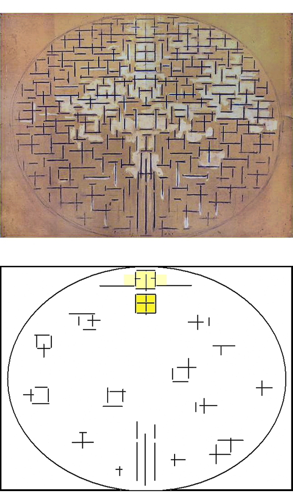
Here too, the multiplicity of signs is expressed through variation of the perpendicular relationship. A certain number of signs are formed by the intersecting of a horizontal line and a vertical. As in the previous compositions, each sign differs in relation to the amount of one direction encountering a different amount of its opposite.
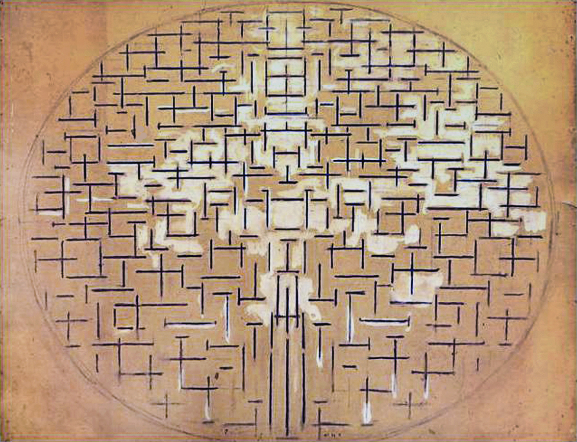
Many other signs instead consist of a single direction, being exclusively horizontal or vertical. See highlighted area at the top of diagram below:
Some lines that are identical in terms of direction and size are laid out parallel and adjacent to one another to form a pair (see highlighted area at the bottom), a pattern that already appears in some drawings of the sea produced by Mondrian in 1914-15. This pattern suggests a momentary reduction in spatial variation.
On reading the multitude of linear strokes and observing them in their particular uniqueness, we are confronted with a space in which everything changes, a manifold space held together by the perpendicular common denominator and the oval arrangement of the whole.
From black dashes to color planes
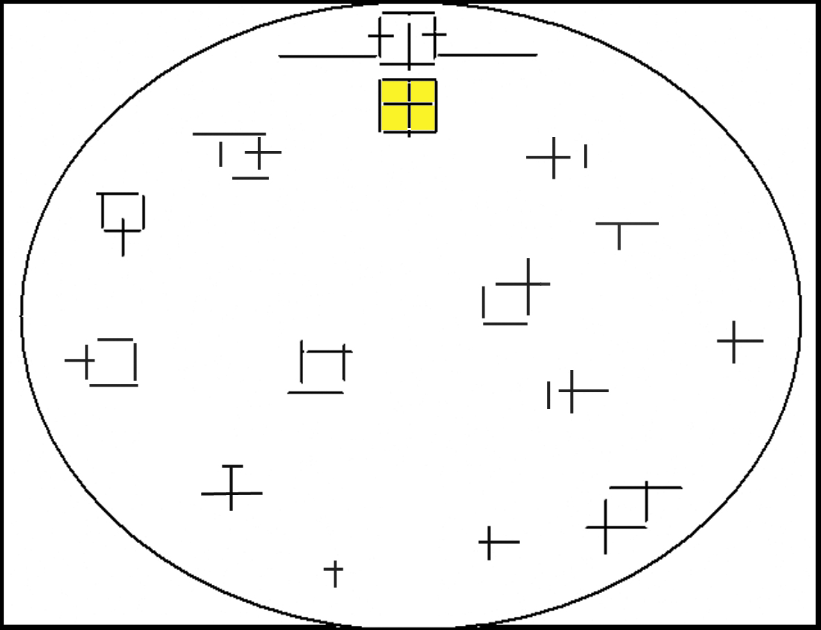
The signs expressing a single direction include some lines that are very short but so thick as to take on the appearance of small planes. This seems to occur to a greater degree in the upper central area of the composition (see diagram in highlighted area at the top), the section occupied by the unitary synthesis of the square in Pier and Ocean 5. The horizontal-vertical opposition appears to decrease in that area practically to the point of disappearing. In point of fact small planes approaching the equivalence of opposites can be detected in this area. It seems that in this way the painter wants to express a tendency toward synthesis that nevertheless remains open to the multiple.
Composition in Line (Second state), 1917
While the equivalence of horizontal and vertical was expressed in Pier and Ocean 5 with two linear marks of same length inside a square, it appears to manifest itself here in the form of small planes tending toward square proportions. These are visible in different areas of the composition but above all in the upper central section.
The linear signs of Composition in Line (Fig. 2) seem intent on becoming planes, which actually appear in Composition (Fig. 3):

Composition, 1916
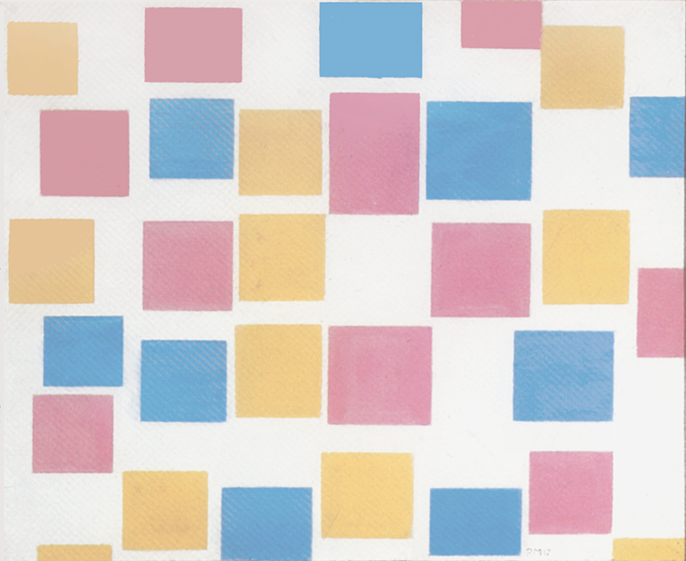
After the Pier and Ocean series of works constructed with linear signs of a graphic nature, painting now appears to reassert its rights. In Composition (Fig. 3) we see planes of blue, pink, and ocher interspersed with black signs and splendid shades of gray.
Blue, pink, and ocher are the colors used by Mondrian for various canvases painted in Paris in the period 1913-14, Cubist canvases with the oval in which the artist would have used bright colors but for their ultimately disruptive effect on the composition.
In Fig. 3 color sometimes emphasizes the panels formed by the black dashes and sometimes expands them. This produces a pleasing rhythm in which the black lines alternate with the sometimes restrained and sometimes overflowing development of the colored areas. The gray seems to suggest a sort of matter ideally uniting the black signs and the colored planes. While everything in this composition moves and leads from one point to another, the space nonetheless maintains a condition of joyful and harmonious equilibrium.
On observing the original – but not so much, curiously enough, in the reproductions – I noted an ocher plane that appears to stand out against the others in the upper central area of the canvas:
Together with another positioned lower down, this plane is in fact lighter than the dominant shade of ocher. The pink also appears in different shades ranging from magenta to flesh tones. I observed the canvas from different distances and that plane continued to stand out. I cannot say whether this depends on the power of suggestion but, by virtue of its position in the composition, that ocher plane inevitably brought to mind the unitary synthesis of Pier and Ocean 5.
Color returns
Color thus returns in 1916 after the “graphic flavor” phase focusing on form (1914-15), i.e. the Pier and Ocean series. Color returns and the background gray, which flows between the colored planes in Fig. 3, becomes white in two subsequent works:
Composition in Color A, 1917,
Oil on Canvas, cm. 45,3 x 50,3
Composition in Color B, 1917,
Oil on Canvas, cm. 45 x 50,5
These two small canvases show a decrease in the number of the black dashes, which become sporadic and form a counterpoint to the colored planes. It is, moreover, in these two paintings that the latter assume sharply defined contours for the first time. Mondrian was later to say that this came about under the influence of the painter Bart van der Leck, with whom he was in contact at that time.
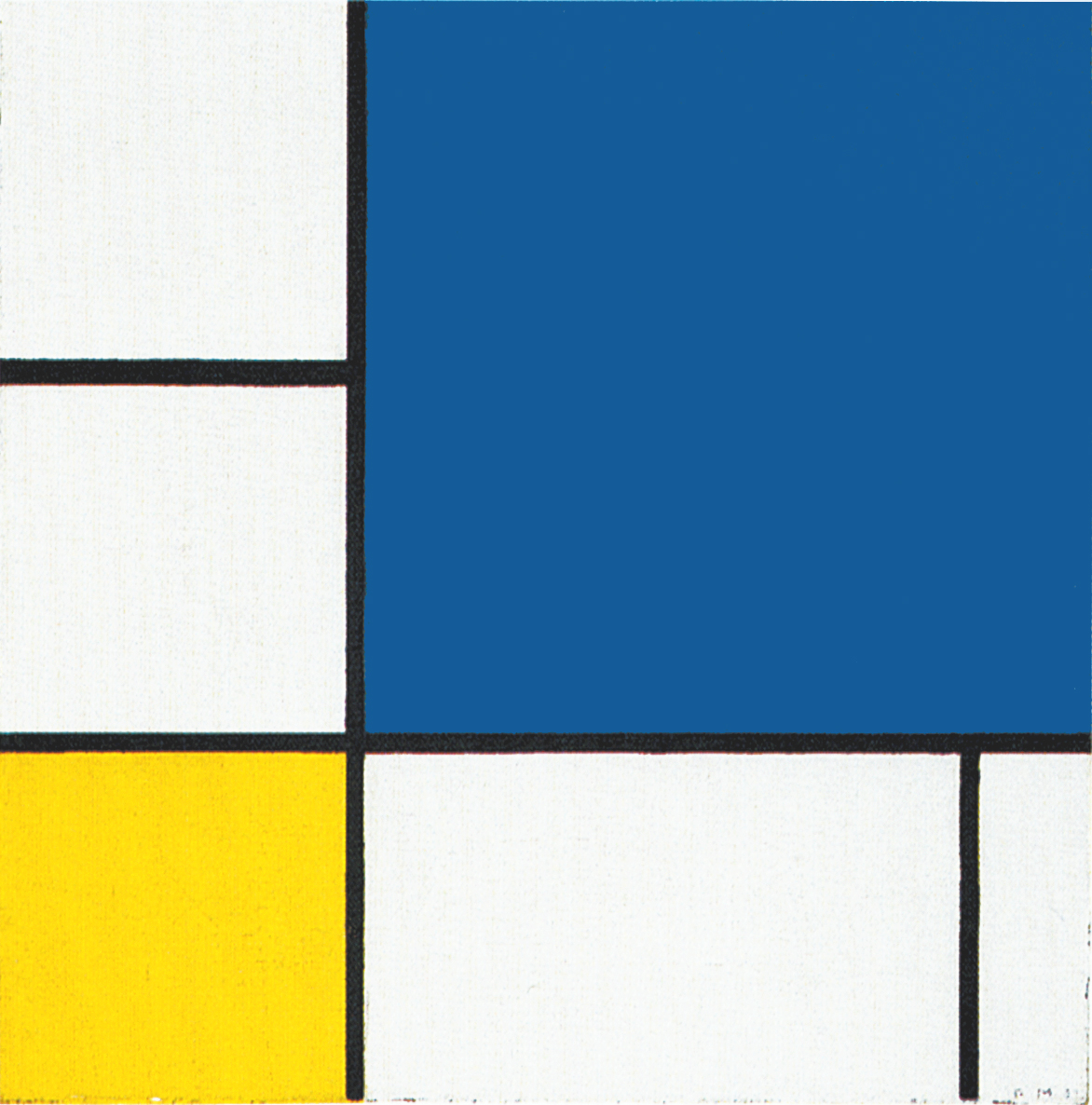
Composition in Color A (Fig. 4) shows in the upper central area a magenta squared shape; it is the largest plane in the composition:
Composition in Color A, 1917,
Oil on Canvas, cm. 45,3 x 50,3
In the same upper central area Composition in Color B (Fig. 5) presents a set of shapes forming a sort of compact unity made of a blu square, a magenta area marked by two black segment suggesting a square proportion below the blue square and an ochre vertical shape to the right:
Composition in Color B, 1917,
Oil on Canvas, cm. 45 x 50,5
In both these compositions we see in the central area a tendency to evoke a sort of synthesis of the elements randomly floating all around.
Fig. 4 shows a synthesis in terms of form (the magenta square) while Fig. 5 hints at a synthesis of the colors:
Composition in Color B, Diagram
Five new compositions
Composition in Color A (Fig. 4) and Composition in Color B (Fig. 5) were followed by compositions using only planes of color (Fig. 6, 7, 8, 9, 10) where the black dashes, which are still sporadically present in the former works, disappear completely:
Composition with Color Planes 1, 1917,
Gouache on Paper, cm. 48 x 60
Composition with Color Planes 2, 1917,
Oil on Canvas, cm. 48 x 61,5
Composition with Color Planes 3, 1917,
Oil on Canvas, cm. 48 x 61
Composition with Color Planes 4, 1917,
Oil on Canvas, cm. 48 x 61
Composition with Color Planes 5, 1917,
Oil on Canvas, cm. 49 x 61,2
The period 1915-17 can thus be regarded as marking the transformation of the black dashes into colored planes.
The sequence shown in the video clip displays gradual transition from a space that is almost exclusively “drawn” (1915) to one that is wholly painted (1917):
Let us now examine these new five compositions with planes of pure color.
Of the five works, Fig. 6 is the composition that presents the greatest degree of complexity, with the planes in the three colors alternating constantly between horizontal rectangles, squares, and vertical rectangles:
Composition with Color Planes 1, 1917
The space of these five works can be read as the development and variation of an ideal parameter (the square form) that changes in color, size, proportion, and position to suggest a manifold space. The rectangles – whether horizontal or vertical – can in fact also be seen as “squares” overbalanced by a sudden predominance of one direction or the other. It is essentially the space of Pier and Ocean 5 expressed entirely in color.
A new search for unity
The predominant colors in these works are again ocher, magenta, light and darker blue together with white. As mentioned, some planes are rectangles with greater vertical or horizontal development while others are closer to square forms.
On observing the variety of planes, we note that some have the same color but differ in terms of proportions while others are analogous in form but differ in color. The planes are sometimes practically the same both in form and in color. The whole is thus made up of a variety of entities evoking a range of different situations.
In Fig. 7 nearly all the yellow planes are similar in terms of proportions, while variations in this sense are more visible with the blue and above all the magenta:
Composition with Color Planes 2, 1917
In some cases two or three contiguous planes can be seen that appear similar in proportions, size, and color, e.g. where three yellow squares are laid out in a vertical row.
Something similar can be seen in Fig. 8, where two blue vertical rectangles of the same size are placed side by side in a horizontal sequence. With the repetition of the same entity, regardless of whether it is rectangular or square, the degree of changeability is reduced and we catch a glimpse of something more constant, while the surrounding planes have already returned to multiplication and differentiation in terms of size, proportion and/or color.
Composition with Color Planes 3, 1917
While the heterogeneous variety of the linear relations attained synthesis with one square in the central-upper area of Pier and Ocean 5, now that the linear relations have become colored planes, we are faced with a variety of squares, some yellow, some pink, and some blue.
The square – a balanced relationship between horizontal and vertical – no longer functions as a unitary synthesis of the composition in these works as it is in Pier and Ocean 5 where the totality of space is expressed by monochromatic variations in the perpendicular ratio. In these new colored works the square form can be a synthesis of horizontal and vertical only of that part expressed in that particular color. A unitary synthesis of the composition, a fundamental issue for Mondrian, would therefore need to be attained from now on also between the different colors.
The planes are separate from one another in Fig. 6, 7, 8 but connected in some cases in Fig. 9 and 10:
Composition with Color Planes 4, 1917
Fig. 9 presents pairs of planes colored blue and ocher, blue and pink (upper left), and ocher and pink (lower right). Clusters of ocher and light pink or light pink and grayish blue planes can be seen in Fig. 10. In joining the planes, the painter seems to look for a synthesis of the colors as well as greater cohesion between the parts:
Composition with Color Planes 5, 1917
Fig. 10 is the composition presenting a greatest degree of spatial synthesis with a smaller number of colored areas developed in larger and homogeneous proportions. The shades of color are also less pronounced.
With respect to Fig. 6, the sense of variation and complexity decreases in Fig. 10 in terms both of form and of color. Mondrian now appears to focus on overall perception of the composition. This recalls the initial Cubist phase, when the painter again reduced the range of colors in response to insufficient unity of the composition.
In Fig. 10 the center of the canvas is occupied by a large ocher square that seems designed to stand out with respect to the others. We have seen something similar in Composition in Color A which shows in the upper central area a large magenta squared shape. Once again we note how the central area of the painting is where Mondrian tries to evoke a synthesis of the composition:
A synthesis of colors
What we have seen so far points to a search for cohesion and synthesis at the level of form. Let us now see how the painter also seeks synthesis and unity at the level of color.
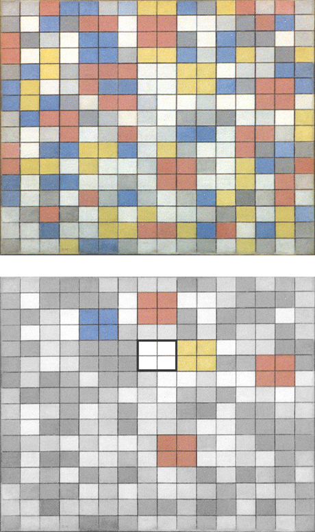
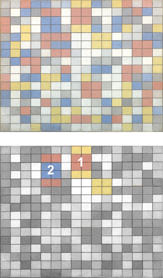
Fig. 6 and 7 present a white square area in the center surrounded by three planes of the same color: three yellow and one red in Fig. 6, three magenta and three yellow in Fig. 7:
Composition with Color Planes 1, 1917 with Diagram
Composition with Color Planes 2 , 1917 with Diagram
The planes of the same color reduce the sense of variation towards the center whereas in other parts of the composition the same colors disorderly change. A similar degree of constancy is to be found in the higher right corner of Fig. 7 with two blue and two yellow planes orderly placed around a white square field. The planes of the same color endow the central area of the composition with greater stability around a white squared field. Is this white field perhaps intended to suggest an ideal synthesis of all the colors?
The painter appears to seek unity of the composition by reducing the number of planes and softening their colors (Fig. 10), connecting them with one another (Fig. 9), and increasing the constancy of forms and colors in the central area (Fig. 6 and 7).
The birth of lines
Years later Mondrian said that in the above five works the planes floated freely in space and the whole composition lacked cohesion. “Feeling the lack of unity, I grouped the rectangles together.” (Mondrian, 1943). Joining the planes was equivalent to creating lines between them (Fig. 11).
Composition with Color Planes and Gray Lines 1, 1918,
Oil on Canvas, cm. 49 x 60
“Feeling the lack of unity, I grouped the rectangles together: the space became white, black, and gray; the form became red, blue or yellow. Joining the rectangles was equivalent to continuing the verticals and horizontals of the previous period over the entire composition.” (Mondrian, 1943)
An interesting innovation with respect to the previous canvases is found in the fact that the white now also assumes the concrete nature of a plane and this reasserts my interpretation of the central white square field performing the function of a plane. Others have instead read the white as a background in relation to the colored planes. Mondrian attaches to the supposed “void” of white the same solid value as is expressed through the more concrete planes of color. For Mondrian the visible is equivalent to the invisible.
Fig. 11 presents planes of blue, magenta-pink, ocher, gray, and white alternating to develop predominantly vertical areas, more balanced proportions, and horizontal rectangles of different sizes. Some planes seem to extend beyond the edge of the canvas.
Two vertically arranged planes, one blue and the other magenta, develop analogous squared proportions in the upper central section. A similar pair of planes is repeated in the lower section but this time with the blue to the right of the pink and a slight decrease in overall size with respect to the pair above:
Composition with Color Planes and Gray Lines 1, 1918
Diagram
Two squares of different color join in the center. I recall the central square of Pier and Ocean 5, as well as the central white squares of Fig. 6 and Fig. 7.
Two squares of different color join in the center once in a horizontal alignment and once in a vertical alignment. The pair appearing in horizontal alignment in the lower part is rearranged vertically in the upper. The horizontal (for Mondrian a symbol of the natural) is concentrated into a vertical (a symbol of the spiritual).
The two pairs of planes express an area of space in which something endures while changing in appearance (once horizontal and once vertical). We contemplate something that appears in a different way or two apparently different things that can be traced back to the same one.
The composition invites us to contemplate variable entities (the natural) tending towards a synthesis (the spiritual) which in turn remains open to a relative plurality. Once again, the center of the painting suggests a more constant area of space while all around we see the uncontrolled variation of sizes, proportions and colors.
The ongoing search for unity
Having joined the planes of the previous compositions, Mondrian still appears dissatisfied with the result. The lack of unity he noted in the canvases of 1917 still awaits a solution. Color is thus relinquished once again in order to concentrate on formal layout in two subsequent works Fig. 12 and Fig. 13:
Composition with Grid 3, Lozenge Composition, 1918,
Oil on Canvas, Diagonal cm. 121
Composition with Grid 4, Lozenge Composition, 1919,
Oil on Canvas, Diagonal cm. 85
In Fig. 12 a basic layout is drawn on a lozenge canvas. Lines running parallel to the sides of the painting are used to divide its surface into a number of squared sections.
These are divided in turn by diagonal lines (perpendicular with respect to the viewer) running across the entire composition and increasing in thickness in some sections. The increase in thickness highlights some areas of different proportions and size (Fig. 13).
The variation in thickness of the lines disrupts the regular basic pattern, which is thus transformed into an asymmetrical rhythm. While Fig. 12 seems to be informed by a need to establish order, there appears to be greater balance between order and mutation in Fig. 13.
The thicker lines of Fig. 13 suggest square and rectangular fields, which in fact take shape in two later works Fig. 14 and Fig. 15:
Composition with Grid 5, Lozenge Composition, 1919,
Oil on Canvas, Diagonal cm. 84,5
Composition with Grid 6, Lozenge Composition, 1919,
Oil on Canvas, Diagonal cm. 68,5
In these new works Mondrian introduces color once again after having injected order into the formal structure with Fig. 12 and Fig. 13.
While the composition thus varies again through color as in the five compositions with color planes painted in 1917, this variation appears to be balanced by a certain constancy of the formal structure. The basic schema of Fig. 13 is in fact repeated in Fig. 14 and 15, but no longer clearly drawn out as in Fig. 12 and 13. Though barely visible, the schema is, however, present and underpins the arrangement of the colored planes, which can in fact all be traced back to the basic parameter of a square module.
Consider Fig. 14 in the diagram:
Composition with Grid 5, Lozenge Composition, 1919
Diagram
A basic unit (A), a small square, doubles to form a rectangle, either vertical (B) or horizontal (C), which is then duplicated to generate a larger square (D). Larger rectangles are then born out of the combination of the square and the smaller rectangle (E and F). The large rectangle is formed by six small squares, the large square by four, and the small rectangle by two. The space changes from the smaller planes to the larger but retains something constant. The need always felt by Mondrian to express what he calls the Natural (the changing variety) and what he defines as the Spiritual (what remains constant) again finds balance.
A measured change
The composition no longer develops in a wholly random way, as it does in Fig. 11. Every plane now stems from the aggregation and gradual growth of a single entity that, as professor Hans L. C. Jaffé says, “tends to form larger units”.
The same shape appears different because it is in another color and the same color differs in appearance in relation to its proportions and relations with neighboring parts. An element of the same size and the same color can then appear once in the horizontal and once in the vertical. In this way, a variety of situations is produced that can nevertheless be traced back to certain constant values. Everything changes but something remains.
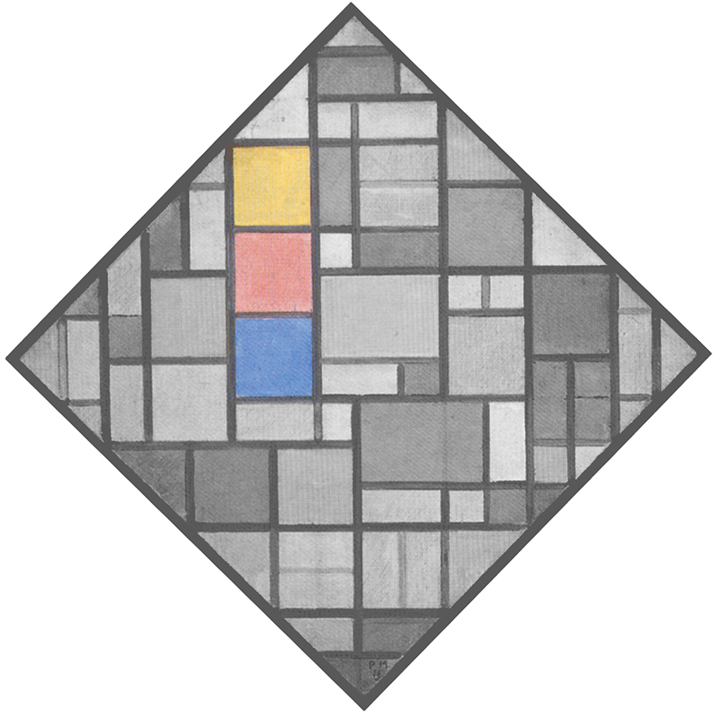
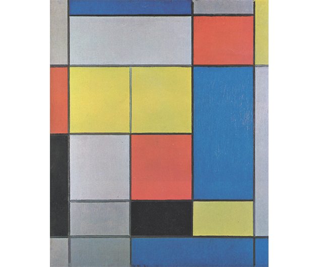
Fig. 15: Three squares of the same size, one blue, one red and one yellow, form a compact and regular layout which suggests constancy and unity if compared with other parts of the composition where forms suddenly change.
Composition with Grid 6, Lozenge Composition, 1919
Diagram
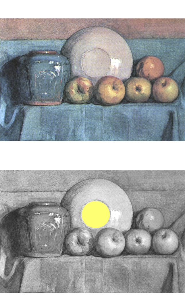
The painter tries here to suggest a synthesis of the colors which could appear in a more evident way than the one tried out with the rather faint white square field in the center of Fig. 7. The solution of three superimposed squares however does not satisfy Mondrian either since he needs to express unity through a single and compact shape: one circle (Apples, Ginger Pot and Plate on a Ledge, 1901), one rectangle (Composition II, 1913) or one square (Pier and Ocean 5, 1915) whereas the unity tried out with Fig. 15 appears as a juxtaposition of three distinct squares.
We thus have once again, in a new form, the same space with two contrasting tendencies: opening up to the heterogeneous appearance of the world on the one hand and contemplation of what connects and ideally unites the variety of different things on the other. When variable appearance prevails (Fig. 11) the painter seeks order (Fig. 13); once this is re-established, he opens up again to variable appearance (Fig. 15).
We shall now see how this dialectic between the mutable and the constant, multiplicity and unity, that is, between what the artist named respectively the Natural and the Spiritual, continues with new compositions which mark substantial progress in defining the new Neoplastic vocabulary which will inform all the subsequent work.
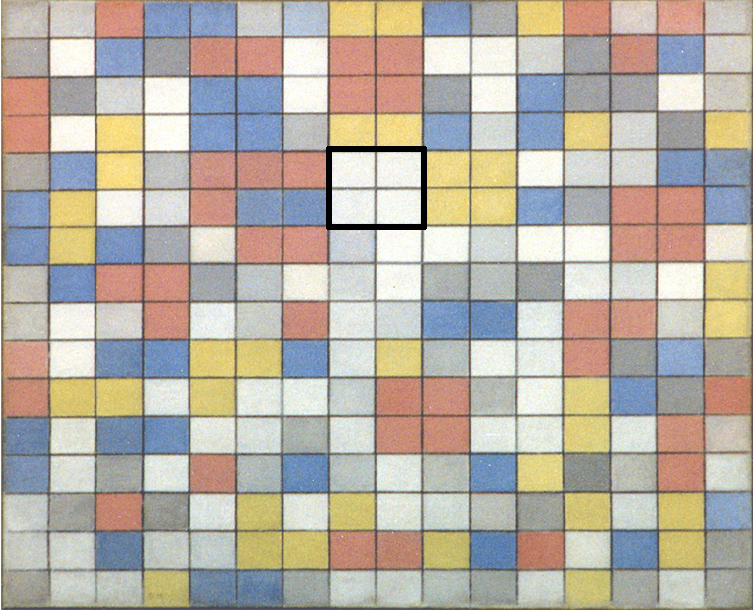
The checkerboard compositions
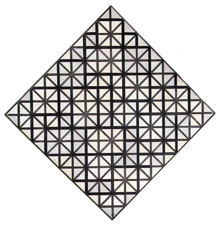
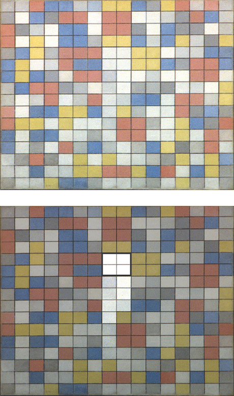
In Composition with Grid 9 – Checkerboard Composition with Light Colors (Fig. 16) and in Composition with Grid 8 – Checkerboard Composition with Dark Colors (Fig. 17) the painter draws a new schema in which the linear segments of the previous compositions become continuous straight lines running across the entire surface of the canvas, giving the composition a more dynamic appearance:
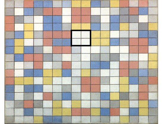
Checkerboard Composition with Light Color, 1919,
Oil on Canvas, cm. 86 x 106
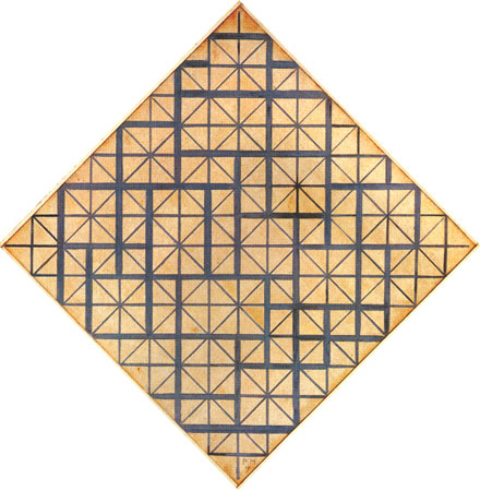
Checkerboard Composition with Dark Color, 1919,
Oil on Canvas, cm. 84 x 102
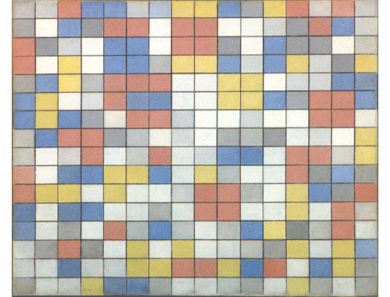
The painter begins once again with a schematic division of space. Each side of both canvases is divided into 16 units so as to divide the surface into 256 rectangles of the same size with the same proportions as the canvas. This gives birth to a wholly regular and constant layout in terms of form that is transformed by the alternation of color into an asymmetric whole of variable appearance.
The colors are not flat and uniform, as they appear in standard reproductions. There are extremely subtle variations of every primary color, as there are of every shade of gray. As H. L. C. Jaffé writes: “The painter let himself be guided by his feeling for color and rhythm, and he made alterations and corrections as he worked; over paintings to change the color of some of the areas can still be detected. The skilled treatment and masterly balance of the canvases are the result not of a theory but of almost thirty years experience as a painter.”
Checkerboard Composition with Light Colors
We observe a multitude of planes colored yellow, red (a light red verging on a light magenta pink that I shall in any case call red), and light blue mixed with other planes of gray and white. At least three different shades of gray can be seen. The straight lines are a darker gray that becomes almost black in some sections. The rectangles alternate with one another to create a variously articulated space.
On observing the multitude of colored rectangles, we note that two, three, and even four rectangles of the same color gather in some areas to form larger units:
Checkerboard Composition with Light Colors, 1919
with Diagram A
We see a larger rectangle of a yellow color, one of blue, and three of red. Here too, as in the previous canvases, Mondrian therefore employs a grouping of basic entities that generate larger ones. The composition as a whole is not, however, so strictly governed by the process of aggregation and growth, as it was in the previous canvases. This process now manifests itself sporadically.
The composition is a succession of sequences made up of small rectangles of different colors that finds a moment of comparative rest in the larger rectangles.
The ephemeral progression of new events (the small rectangles) is transformed in the larger units into a space of relatively greater duration and stability.
Note how the opposition between vertical and horizontal lines manifests itself with greater clarity and balance in a homogeneous field of color like that of the larger rectangles. The perpendicular opposition instead proves less stable when the colors change around the point of intersection between vertical and horizontal. What appears in synthetic and unitary form in the larger rectangle is unbalanced elsewhere by the various colors gathered around the points where the lines intersect. If it is form which highlights balance between horizontal and vertical black dashes in Pier and Ocean 5, it is color that highlights the most balanced syntheses of the two opposite directions in this composition.
Nature as a variation of the same basic elements
Having identified a larger unit, the eye spontaneously seeks others and is obliged in this search to address many other situations involving the absence of one or two basic units needed to form a homogeneous rectangle, the others being of a different color. In seeking larger rectangles of a single color we contemplate the virtually infinite variation of entities born out of different combinations of same elements.
Isn’t nature an infinite variation of entities born out of always new and different combinations of same basic elements?
The heterogeneous appearance generated by the quick succession of small rectangles becomes more homogeneous in the larger rectangles; from the ethereal and random to greater constancy and stability before returning to the haphazard succession of different things and moments; from the variety of the external world to mental syntheses that then open up again to an unpredictable multiplicity.
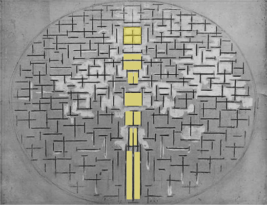
In addition to the five larger rectangles expressed in the three primary colors, Checkerboard with Light Colors presents one in white that, like the other larger rectangles, also contains black lines forming a balanced relationship between horizontal and vertical:
Checkerboard Composition with Light Colors, 1919 with Diagram A
This is the only white rectangle of larger size present on the canvas. Its position is perfectly central with respect to the sides of the canvas and slightly raised.
The white rectangle appears to be generated through a progressive purification of the colors that takes place along the vertical axis running through the center of the canvas. The vertical field can be seen as a dynamic upward progression leading to the white rectangle:
Checkerboard Composition with Light Colors, 1919 with Diagram B
This recalls the development of the central square in Pier and Ocean 5 Mondrian painted in 1915.
In both works we can see an upward progression from the bottom that develops along the central vertical axis of the composition and generates in the upper central area a square in 1915 and a white larger rectangle in 1919:
Checkerboard with Light Colors, 1919
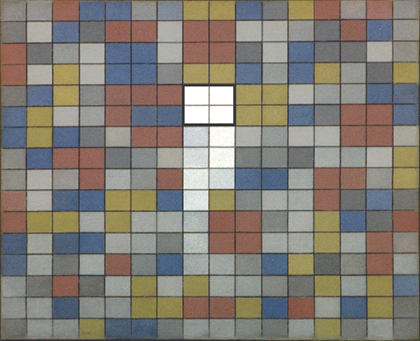
Diagram B
Like the square of Pier and Ocean 5, the white rectangle of Checkerboard with Light Colors expresses a unitary synthesis of the composition:
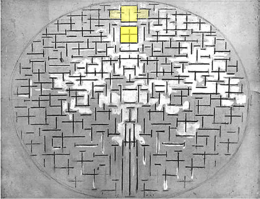
Diagram B
Checkerboard with Light Colors, 1919, Diagram C
It is in fact in that point that the composition attains a synthesis and equilibrium of opposites in terms not only of form (horizontal / vertical), as in Pier and Ocean 5 and in the yellow, red or blue larger rectangles of Checkerboard with Light Colors, but also in terms of color (black and white).
I shall endeavor to explain:
Color and non-color
The painter still distinguishes in this phase between color (yellow, red and blue) and non-color (white, black, and gray) seeing the first as a plastic symbol of the Natural and the second as symbolizing the Spiritual.
Mondrian: “The unchangeable (the Spiritual) is expressed in the composition by means of straight line or planes of non-color (black, white, and gray), while the changeable (the Natural) is expressed by means of planes of color and rhythm.”
For Mondrian yellow, red, and blue constitute a plastic symbol of the purest and most intense colors in the world. He uses the three primary colors here to express bright contrast and diversity while white and three different shades of gray produce an equally broad range of variation that appears, however, more homogeneous than the contrasting variation generated with the primary colors.
Checkerboard with Light Colors, 1919
On observing the range of grays (especially from real..), we note that the darkest shade appears to be as dark as the blue, just as the lightest shade of gray appears to be equivalent to yellow. It is as though the range of the primary colors had been transposed into a parallel range of grays that intrinsically appear more unified than yellow with respect to red or red with respect to blue precisely because they are different shades of the same “color”. The artist appears to be seeking a common denominator in terms of color.
The colors and “non-colors” of Checkerboard with Light Colors are therefore to be seen as a whole that, on the one hand, blossoms in the showy and discordant variety of yellow, red and blue symbolizing the mutable variety of the world and, on the other, tends toward a synthesis through the more homogeneous variation of grays between the two opposite values of white and black, which attain unitary expression in the central white rectangle crossed by black lines.
Through the “colors” of the Spiritual (black and white) the multifarious appearance of the Natural (yellow, red and blue) reveals unity.
Mutable and unchanging
Looking at Checkerboard with Light Colors we are faced with a space that is exposed, on the one hand, to the pressures of the boundless and colorful physical extension of reality (that gains momentum through the dynamic continuity of the lines) and tends, on the other, to concentrate inside the painting in an ideal synthesis.
The human search for unity (be it the idea of a God or the unifying theories of science) is always counterbalanced by the multifarious aspect of nature and by the unforeseeable evolution of life. Checkerboard with Light Colors presents both aspects. The composition evokes the multiplicity and mutability of what Mondrian called the Natural (intended both the outer and inner worlds) and the more constant syntheses (the Spiritual) mankind always tries to achieve while dealing with the endless, ever-changing variety of the Natural.
Nature and artifice
Now detached from the outward appearance of things, the abstract composition evokes at the same time the natural and the artificial landscapes, i.e., the urban environment in which human beings spend today most of their lives. The canvas serves as a model of space in equilibrium between disharmonies of real space and harmonies of plastic space.
From a drawn space to a painted space
With Checkerboard with Light Colors Mondrian rediscovers in a new form the unity evoked through a square that had dissolved between 1915 and 1917 with the reopening of the Pier and Ocean graphic structure to color:
The transition from a drawn space showing a synthesis of the composition (Pier and Ocean 5) to an all colorful composition in which a unified synthesis is again traceable (Fig. 16) took over four years:
with Diagram
Checkerboard with Light Colors, 1919
with Diagram A
It is worth noting how yellow, red and light blue larger rectangles gather all around the white rectangle placed in the center:
Checkerboard Composition with Light Colors,
1919, with Diagram A
The painter appears intent on gathering together and uniting the three colors in this area and therefore reassert the function of synthesis attributed to the white rectangle.
On top of the white rectangle we see an even larger unit formed by red and yellow (Diagram D Area 1) and to the left of this in a slightly lower position we see a similar pattern formed by blue and red (Diagram D Area 2):
Checkerboard with Light Colors, 1919
with Diagram D
These larger units of two colors suggest a tendency toward a chromatic synthesis.
At the same time, they may suggest a re-opening of the central white unity to the colors all around. Diagram D: The white unity becomes yellow to the right and the yellow rectangle is split higher up by red (1), which is split in turn by blue (2).
Diagram E: Red and blue compete to form a larger rectangle and then flow back into the partial dimension of small rectangles:
Checkerboard with Light Colors, 1919
with Diagram E
This would mean that in 1919, as in 1915, the unitary synthesis produced in the center shows signs of opening up again to manifold space. A space now made up entirely of color. The unity called for by the Spiritual (white) re-opens to the Natural (yellow, red and blue).
A substantial innovation
A substantial innovation of Checkerboard with Light Colors with respect to Pier and Ocean 5 lies in the fact that the synthesis produced in the checkerboard composition appears to be ideally connected with real physical space by means of the straight lines, which express a sense of continuity that seems intent on expanding beyond the finite boundaries of the canvas. The synthesis of 1915 instead appears to be suspended in a universe that is still metaphorically enclosed within an oval:
Diagram highlighting the oval
Checkerboard with Light Colors, 1919,
Diagram F
Connecting plastic space with real space
It is worth remembering that the oval form was for Mondrian a metaphor for the totality of the world which is now suggested by the virtually endless lines. Through the lines, which continue uninterruptedly, the subjective unity (the central white rectangle of Fig. 16) is ideally connected with the assumed totality, an immense space that can no longer be represented as a simultaneous whole inside the canvas (the oval) but remains clearly present to the painter’s mind.
While the oval makes its exit (Fig. I, II, III):
Pier and Ocean 5, 1915
Composition, 1916
Composition with Color Planes 1, 1917
the painter brings the planes closer together and thus obtains lines (Fig. IV); he then discovers a proportional module enabling to express the broadest possible range of variation without losing sight of the required degree of constancy, Fig. V, VI):
Composition with Color Planes and Gray Lines 1, 1918
Composition with Grid 4, Lozenge Composition, 1919
Composition with Grid 6, Lozenge Composition, 1919
In Fig. VI some planes continue beyond the edge of the canvas, but the composition actually appears rather congested. The planes interlock and the linear segments block one another and the space seems to be hampered by its own development.
In Checkerboard with Light Colors the composition opens up to the dynamic traversal of straight lines that evoke a more open and continuous space than in the previous compositions:
Lozenge Composition with Colors, 1919
Checkerboard with Light Colors, 1919
It should be noted, however, that in Fig. 16 the lines do not actually reach the edge of the canvas. Observation of the original work reveals that they stop a few millimeters short, especially at the bottom of the painting. While the lines certainly inject dynamism into the composition, they have yet to assume the independent role acquired during the 1920s. The lines used by Mondrian after 1922 are thicker and run from one edge of the painting to the other, thus confirming the impression of extending beyond the boundary of the canvas to evoke a space of virtually infinite expansion.
A part standing for the whole
As mentioned, previously expressed in a metaphorical way within the closed form of an oval, the totality of space opens up and is transformed over a span of four years into a sense of totality expressed through the continuity of straight lines:
Diagram highlighting the oval
Checkerboard with Light Colors, 1919,
Diagram F
I shall insist on this important aspect: Mondrian appears to use these lines, which he describes as continuing uninterruptedly, in order to connect the unitary synthesis within the composition with the totality of space (metaphorically expressed through the oval). This has expanded in the meantime beyond the canvas and now coincides with the space of reality, of which the work of art constitutes a part that aspires to stand for the whole.
As Maurizio Calvesi points out, the canvas is “an ideal center in which the spatial event is determined in its wholeness and totality no less than in its dynamic continuity. Mondrian wrote in 1920 that the straight lines intersect and touch one another tangentially but continue uninterruptedly. The result radiates out in fact from the painting to the infinite, but the canvas exhausts the intuition of the whole within itself.”
Connecting art and life
Both previously present inside the composition (1915), the square and the oval now coexist virtually (1919). The oval is now the real world and a white rectangle reminds us from inside the canvas that the changeable multiplicity of the world (evoked by yellow, red, blue and the infinite space of the lines) is an indissoluble unity.
While the oval served during the cubist phase to express an idea of the whole, it appeared at the same time as an overly absolute form. Mondrian sought to address the absolute and the universal starting from the relative and the particular, i.e. from the real condition of everyday existence.
The totality of space, that is, the real world, is now expressed through the continuity of the lines, which is why Mondrian was to abolish the use of any frame around his canvases in the subsequent works. The frame interrupts the ideal continuity envisaged between the work of art and real life.
No symbolic value
It should be pointed out here that some critics have attributed the oval used by Mondrian in those years with meanings related to theosophical symbolism. It has been described as a symbol of life, like the egg. It is certainly true that circles and ovals have always suggested a sense of universality, and Mondrian was unquestionably aware of this.
I do not believe, however, that the artist looked up the oval form in the dictionary of theosophical symbols one fine day and decided to include it in his paintings. I am rather convinced that the painter was prompted to use the oval more by his eye than by literary disquisitions and arguments. While these were certainly not extraneous to him, I do not believe they had all that much influence on the development of his paintings.
As Mondrian wrote, “The ancient sages used the cross to represent the eternal relationship of interior and exterior, but neither this nor any other symbol can serve as the means of plastic expression of abstract-real painting. On the one hand, the symbol constitutes a new limitation; on the other, it is too absolute.”
The vital sap of art is form
Painting cannot be explained in terms of pre-established symbols, especially when it involves abstraction. Real abstract art acquires its truest meanings when the relations of form and color are read and interpreted with the mind free of preconceived ideas. The oval was necessary at that time as form, which I regard as the real truest substance of painting.
While many still consider it reductive to speak solely of form, this is precisely where the vital sap of art is to be found. Unfortunately, certain critics of art, being reluctant to attribute importance to form and color and hence incapable of finding the true content of art there, are still obliged to hunt for it in old works of literature. I instead believe that the painting itself offers an abundance of explanations, especially in this case.
I must once again say that I am not here to talk about the beauty of this work as I do not believe that you cannot convey the beauty of a painting with words. The balance and harmony of the composition must be enjoyed by looking at the original painting. I write these notes to point out aspects that make this and other works by Mondrian significant on a philosophical and existential level and especially to show the substantial continuity between earlier and later works.
Substantial continuity
It is worth noting how six years earlier Mondrian had already used a central rectangle to suggest a synthesis of the composition:
All around the central rectangle of Composition N. II we see an endless variation of horizontal and vertical entities prevailing over one another. Some enclosed areas (marked in gray) show attempts of a more balanced relationship between the opposite directions which is then fully attained in the central rectangle. This fundamental idea is expressed in Checkerboard with Light Colors with the larger colored rectangles where the opposite directions do achieve equilibrium which is, however, only a partial one, either yellow, red or blue, before merging into the central white rectangle which evokes a fully attained synthesis of opposites in terms both of form (horizontal and vertical) and color (a white field crossed by black lines).
Checkerboard Composition with Dark Colors
Checkerboard with Dark Colors, 1919,
Oil on Canvas, cm. 84 x 102
I have always regarded this version in the course of my studies as later than the one with light colors, but do not actually know which Mondrian painted first.
Welsh-Joosten’s general catalogue assigns the version with dark colors an earlier number than the one with light colors, which would suggest that the light-colored version is later than the dark one.
In all honesty, I attribute little importance to this point because I think it probable that the artist worked on the two canvases at the same time. What concerns me here is to draw attention to some differences between the two versions that, regardless of the order in which they were produced, place the version with dark colors closer to the works following the two checkerboards.
This version with dark colors starts from the same formal layout as the one with light colors. Once again we see a regular layout made up of 256 small rectangles of the same size, a heterogeneous set of entities that combine in some areas to form larger units of the same color. Two are yellow and two blue in color, whereas red never attains the synthesis of a larger rectangle:
Checkerboard with Dark Colors, 1919
Checkerboard with Dark Colors, 1919,
Diagram A
Unlike the light-colored version, the dark presents only what Mondrian referred to in that phase as “color”, whereas “non- color” (black, white, and gray) is wholly absent. Only a few short stretches of line appear to be black. All the planes are yellow (a golden yellow verging on ocher), red (almost amaranth), and dark blue. The chromatic substance is denser and richer than in the version with light colors. The painter thus appears to accord priority in this work to matter and color, i.e. to what he identified most with the Natural.
Following the changing rhythm of the colors, we observe some small rectangles that are symmetrically arranged in the central area:
Checkerboard with Dark Colors, 1919
Checkerboard with Dark Colors, 1919,
Diagram B
Moving upward from the bottom, we see a yellow rectangle alternating with a blue rectangle, then two red rectangles and two blue rectangles, while the symmetry expands on the sides. The symmetrical arrangement exists but is not immediately visible.
While the Checkerboard with Dark Colors lacks a unity of opposite values (black and white) as we have seen in Checkerboard with Light Colors, we can see in its place an area of space that, though entirely colored, maintains some level of homogeneity with respect to other areas of the painting, where everything instead changes at random.
Checkerboard with Light Colors
Checkerboard with Dark Colors
Where a unitary synthesis of opposite values is seen in the version with light colors, there are now the three primary colors, which appear with their symmetrical arrangement to provide the element of constancy required by the consciousness on beholding the ever-changing appearance of reality but without concentrating to form a single white plane, as happens in the other checkerboard composition. It seems as if in the dark color version Mondrian wanted to extrapolate the Spiritual (the symmetrical section) from the Natural (the primary colors).
A white and black synthesis opens up to colors
In the dark-colored version Mondrian seems to want to open the synthesis of the opposite values (black and white) seen in the light-colored version to the intermediate values (yellow, red, and blue) to express a unity that remains open to the multiple. This is in fact what we have seen since Pier and Ocean 5 where the synthesis (the central square) reopens to the multiple. This is one of the fundamental ideas that, as we shall see, guided all the work of the Dutch master up to his last two paintings: Open as much as possible the Spiritual to the Natural without, however, loosing sight of it.
The opening up of a white and black square (1920) to the primary colors (1942) will be the guiding thread of Mondrian’s entire oeuvre:
A yellow, red and blue unity
Observe the larger blue rectangle in the upper central area of the composition. The pair of small rectangles (yellow and red) on its left is repeated in identical form on the right:
Checkerboard with Dark Colors, 1919
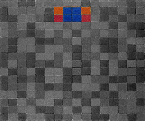
Diagram C
It is as though the painter was seeking here to express a unitary synthesis of yellow, red, and blue. Through the symmetrical area and the aggregation of the three colors, the central area of this composition suggests a certain tendency toward synthesis that, however, remains open with respect to the light- colored version. As mentioned, there appears to be a fusion of unitary (black and white, symbols of the spiritual) and manifold aspects (the three primary colors, symbols of the natural) in this work.
Compared with the light-colored version Checkerboard with Dark Colors shows another noteworthy characteristic:
As pointed out above, while the lines in the previous canvases intersect and limit one another, they extend in the two checkerboards to give the whole composition a sense of open continuity. However, on comparing the two checkerboards, we can see that the lines of the version with dark colors display less continuity than those in the light version:
Checkerboard with Light Colors,
1919
Checkerboard with Dark Colors,
1919
The lines are almost completely uniform in the light-color checkerboard but show a slight variation in thickness in the dark-color version as well as changes in hue, ranging from a dark gray verging on black to shades of brown and ocher that almost arrive at yellow:
Checkerboard with Dark Colors,
1919
The picture here shows an enlarged detail where this discontinuity can be better seen. With respect to the version with light colors, the lines in the dark version seem to be divided into linear segments.
Through discontinuous values of thickness and color, the straight lines of the dark version seem to partake of the finite and relative nature of the rectangles more than in the version with light colors, where the lines appear to be more absolute and their continuous, uniform space to be uncontaminated by the fragmented space of the planes.
The discontinuous lines of the dark checkerboard seem designed to suggest a point of transition between the virtually infinite space of the lines and the finite dimension of the planes.
The formal layout remains wholly constant in the light version and the only variation is in color. In the dark version the form also begins to express a sort of rhythm in the irregular alternation of linear sections. I am therefore inclined to believe that Checkerboard with Dark Colors should be regarded as subsequent to Checkerboard with Light Colors in the sense that it lays the foundations for the developments observed in the subsequent paintings, where the formal layout also becomes asymmetrical and a more obvious difference is seen between linear segments and continuous lines.
As pointed out above, Mondrian may have begun the dark version before the light one. On the basis of what I can see and in the light of the later developments, however, I regard the dark version as intermediary between the version with light colors and two following composition dated 1920:

The Neoplastic vocabulary
These two checkerboard compositions and especially the dark-colored version constituted Mondrian’s first exhaustive formulation of what was to become the Neoplastic vocabulary underpinning all the subsequent work. From now on, Mondrian’s painting was to be a complex and dynamic set of relations between lines, segments, and planes (of color and “non-color”); between infinite space (lines) that becomes finite space (segments and planes) and then re-expands to a virtual infinite space of endless lines. A process Mondrian used to define as “subjectivization of the objective and objectivization of the subjective”.
The dynamic and multiform aspect of natural and/or urban space is transformed on the canvas into a whole endowed with greater synthesis and equilibrium before returning to a dynamic state. The canvas serves as a model of space in equilibrium between harmonies of plastic space and disharmonies of real space.
next page: Neoplasticism – Part 1
back to overview
Copyright 1989 – 2024 Michael (Michele) Sciam All Rights Reserved More