Please note: If on devices you click on links to images and/or text that do not open if they should, just slightly scroll the screen to re-enable the function. Strange behavior of WordPress.
Piet Mondrian’s pursuit of an ideal equivalence of opposites
In the previous pages we have often spoken of the equivalence of opposite drives with reference to the duality characterizing human being. However, the search for an equivalence and synthesis also refers to our relationship with the external world and is in truth one with it.
Opposite concepts are an expedient devised by human thought to reduce and concentrate the vast range of variation present in nature. Given the impossibility of conceiving and representing the real extension and immense variety of the world, the human mind has recourse to the two most different values. It is a device serving to make finite – i.e. thinkable and comprehensible (in the sense of containing, encompassing) – an extension that is actually infinite and hence unthinkable as a whole.
To give a concrete example, there is a virtually infinite range of grays between black and white that we really cannot conceive in all its real breadth and variety. The reference to opposite values is a mental stratagem serving to encapsulate the endless multiplicity of reality. It should always be remembered that this reduction is not the reality of nature but rather of thought.
The interaction between opposites such as multiplicity and unity, changeable and constant goes on with new works.
As we have seen in the previous page, along with the compositions that feature a large square enclosed by four sides:
Oil on Canvas, cm. 42 x 50
cm. 42 x 48,5
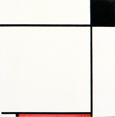
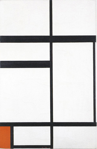
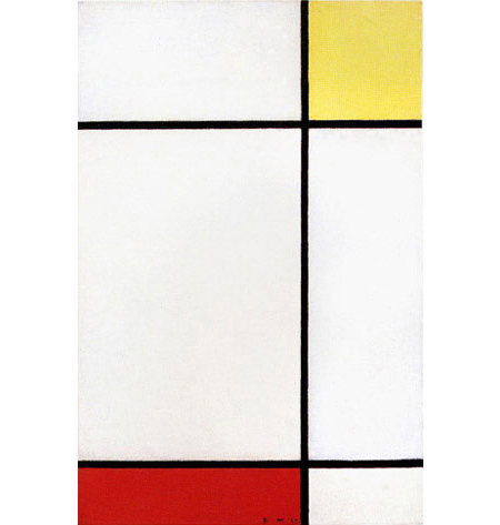
Some works of the same period present a large or medium-sized square left open on one or two sides:
cm. 99 x 101
cm. 48 x 48
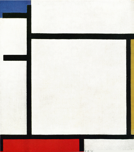
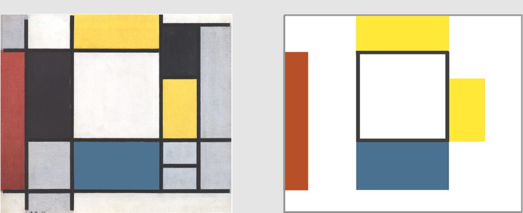
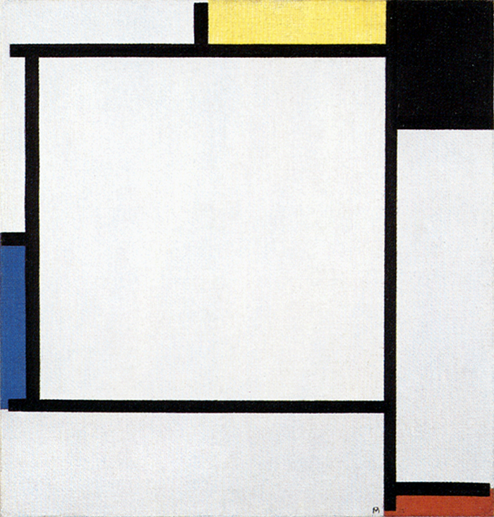
This trend took shape around 1925, when some canvases of rectangular format began to present the common characteristic of an opening on one side of the large square previously bounded on all four sides. The white square field appears to expand beyond the finite plane of the canvas:
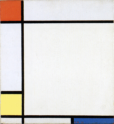
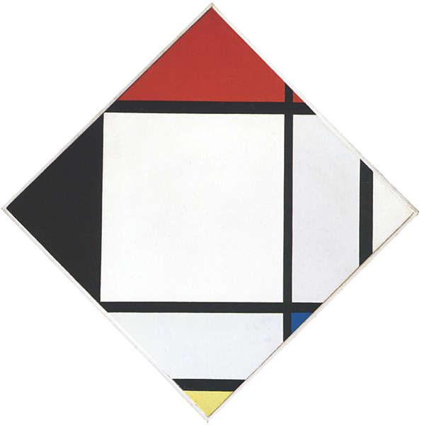
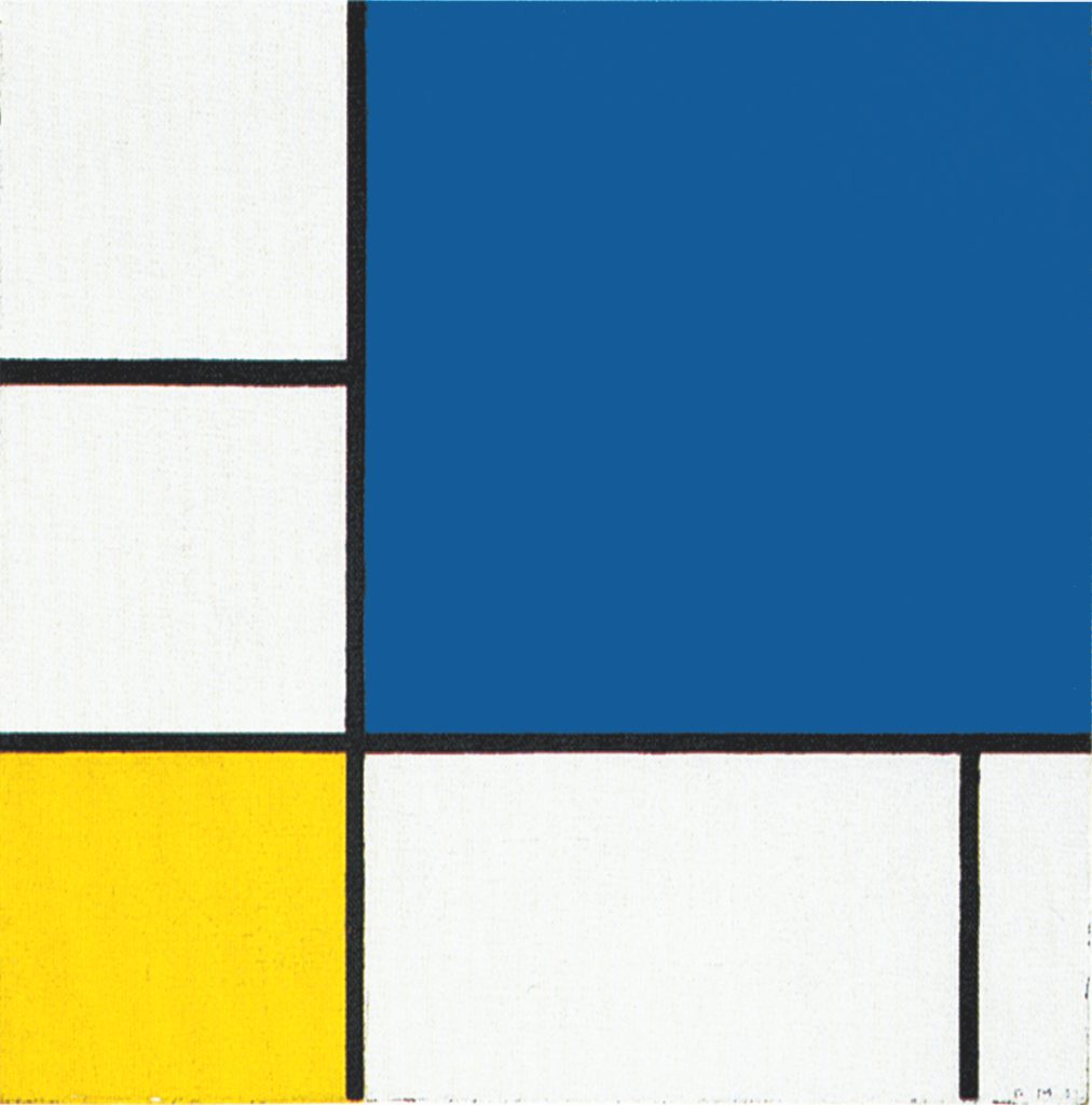
Tableau X with Yellow, Black, Red and Blue, 1925,
Oil on Canvas, cm. 42,5 x 49
Composition with Red, Black and Gray, 1927, Oil on Canvas,
cm. 56 x 56
Composition with Red, Yellow and Blue, 1927, Oil on Canvas,
cm. 35 x 38
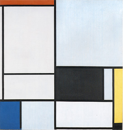
During the 1920’s The lines have grown in thickness and continue beyond the perimeter of the canvases. As Maurizio Calvesi points out, the canvas is “an ideal center in which the spatial event is determined in its wholeness and totality no less than in its dynamic continuity. Mondrian wrote in 1920 that the straight lines intersect and touch one another tangentially but continue uninterruptedly. The result radiates out in fact from the painting to the infinite, but the canvas exhausts the intuition of the whole within itself.” The lines hint at the immeasurable extension of physical reality the canvas is part of; a part which aim at ideally concentrating the whole in its essence.
Fig. 1, 2, 3 show a tendency to open up the square to the dynamic continuity of the lines; compenetrate finite space (the square field) with the virtually infinite space evoked by the lines, that is to say, open up unity to multiplicity.
Recall Pier and Ocean 5 where we have seen the central square evoking unity opening higher up to duality and then flowing back into the manifold space around:
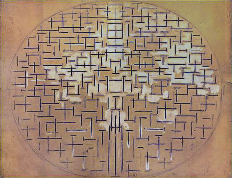
1915
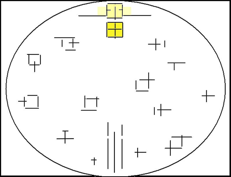
Diagram
Every synthesis generated by thought is necessarily partial and temporary, and must therefore open up again to the multiform and ever-changing aspect of physical reality.
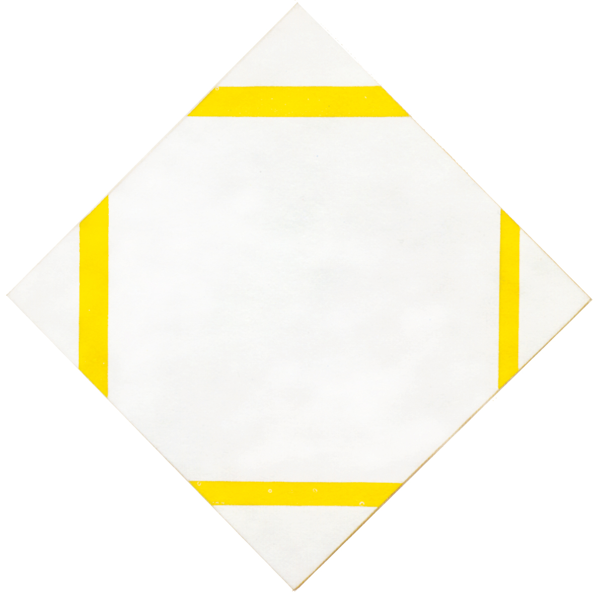
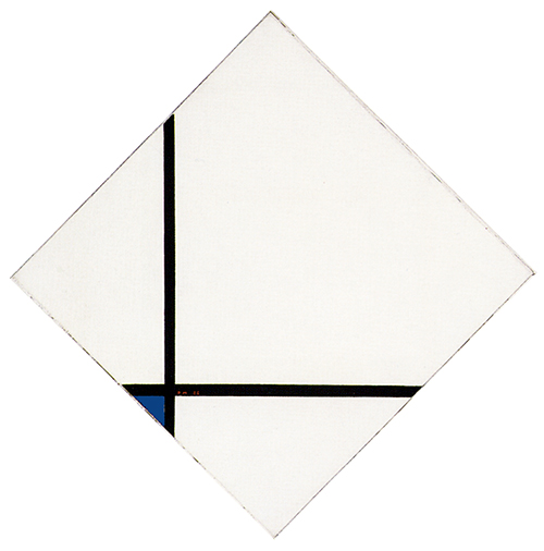
The tendency to open up and expand the square beyond the finite boundary of the canvas is developed in new lozenge compositions as well:
Tableau N. 1 – Lozenge with Three Lines and Blue, Gray and Yellow
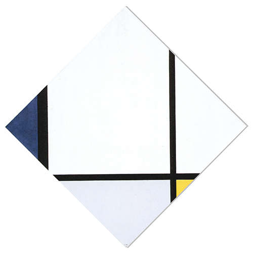
Tableau N. 1, Lozenge with Three Lines
and Blue, Gray and Yellow, 1925,
Oil on Canvas, cm. 80 x 80
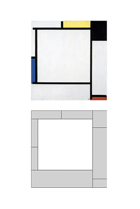
One horizontal and two vertical lines run across the canvas and divide it into sections. The horizontal and the right vertical appear to be of equal thickness while the vertical on the left is thicker, which seems to make up for its lesser extension. The thickness of a line can also serve in a space moving toward ever-greater synthesis to calibrate the weights and influence the overall economy of the composition.
The closed approximate square to be seen in the central area of Lozenge Composition with Red, Black, Blue and Yellow now becomes a field that is open at the top and appears simultaneously to expand also toward the right by virtue of the fact that the area corresponding to the right corner of the lozenge is the same shade of white as the square field, whereas the area below is gray. A small yellow plane appears in the lower right section and the overall balance is restored toward the left by the thicker line and the blue plane.
Diagram A
Diagram B
Examination of the horizontal line in relation to the right vertical reveals a rectangular area extending upward (Fig. 4 Diagram A), while the relationship between the same horizontal, the left vertical and the blue plane tends to generate a horizontal field that the right corner of the lozenge draws toward itself (Fig. 4 Diagram B). The eye is drawn respectively downward and upward by the horizontal (Fig. 4 Diagram B) and the vertical (Fig. 4 Diagram A) areas, the relationship between which generates an indefinite square field that expands and contracts under the influence of the contending directions.
The space as a whole is in a state of unstable equilibrium and attains unified expression for an instant through the progressive and almost simultaneous recombination of parts, none of which – it should be noted – constitutes in itself a definite unitary synthesis like the square bounded on four sides:
Tableau N. 1, Lozenge with Three Lines
and Blue, Gray and Yellow, 1925
The virtual square expands upward beyond the perimeter of the canvas, projected ideally toward the infinite, while the notes of color (above all the blue on the left) draw the eye back toward the lower central area. White symbolizes the spiritual and the primary colors the natural in the Neoplastic vocabulary.
We can therefore imagine this composition as a metaphor of the relationship between the absolute drives of the spiritual drawn back toward the concrete by the part of man that is closest to the natural world: a dynamic relationship between opposite drives that attain equilibrium for an instant through reconciliation.
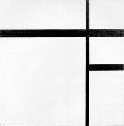
Composition with Two Lines and Blue
Here the space is pared down even more to the bare essentials with two perpendicular lines running across the canvas and alluding to a square field now open on two sides. The top and right corners of the lozenge seem to expand the inner area of the “square”:
Composition with Two Lines and Blue, 1926,
Oil on Canvas, Diagonal: cm. 84,9 x 85
It is, however, legitimate to wonder whether this is still a square or instead an evocation of a possible square that has already moved outside our visual field before being able to make its appearance.
The lines expand the white field to infinity; the blue draws the space back toward a more concrete dimension.
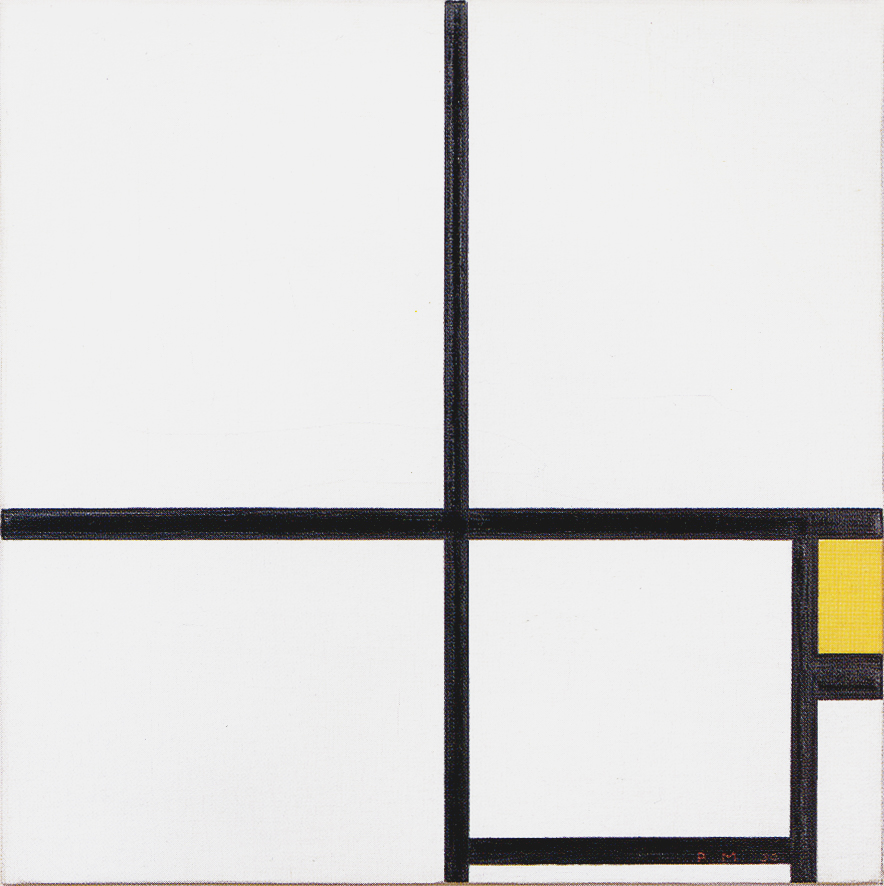
The square opens up to reappear in enclosed form
While the large square opens up and expands, Mondrian was working on other compositions where a large square again appears in a closed form clearly defined by four sides:
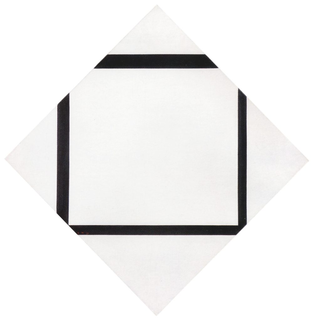
Tableau I – Lozenge with Four Lines and Gray
A square expands slightly beyond the perimeter of the canvas toward the right and the bottom:
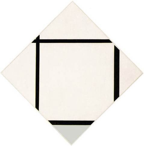
Tableau I, Lozenge with Four Lines and Gray, 1926,
Oil on Canvas, Diagonals: cm. 113,7 x 111,8
We use the term “square” in order to facilitate communication even though this is not really the shape if considered in strictly geometric terms. We shall, however, continue to describe it as such for the sake of convenience.
The upper and left sides are of equal and the lower and right of increased thickness. The field outside the square in the lower section is gray
Note how the point of intersection between the horizontal and vertical lines becomes less visible inside the canvas. Two lines still meet in the upper left section but practically on the edge. The other lines express no points of visible opposition.
Composition 1 – Lozenge with Four Lines
The meeting points of the opposite directions are practically no longer visible in this work. The contrast and opposition between vertical and horizontal lines is resolved here in a continuous space that finds unity by following the square form uninterruptedly from one side to the other.
Composition 1, Lozenge with Four Lines, 1930,
Oil on Canvas, cm. 75,2 x 75,2
For the first time, all the four lines forming the square field differ in thickness, which increases as we proceed clockwise from the vertical on the right. We thus see a square that progressively tends to expand beyond our field of vision (the canvas).
The tendency toward expansion generated by the position of the lines (above all the upper horizontal) is counterbalanced by an opposite tendency toward concentration. The line moving furthest away (upward) is in fact also the thickest and therefore the one that exerts the greatest downward pressure. Proceeding clockwise from the right vertical side, we see a square that grows heavier as it exits the canvas, i.e. tends to become more solid and permanent while it disappears: a simultaneously changing and comparatively constant space.
In this phase Mondrian is like a composer who gradually reduces the orchestra to a solo instrument, an almost imperceptible sound that can still be varied in an effort to express the whole. It is relations that count in Neoplastic space rather than things in themselves. In a white field crossed by three black lines, a slight variation in thickness becomes more obvious than a red or yellow in a field full of colors.
“Weniger ist mehr” (less is more) was the credo of Mies van der Rohe. It is obviously necessary to know what this “less” that succeeds in expressing “more” actually consists in. The approach is in any case somewhat rare nowadays, when many aspirant creative resort so frequently to redundancy in order to disguise a lack of substance.
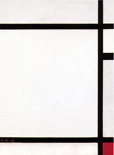
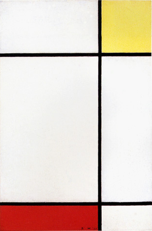
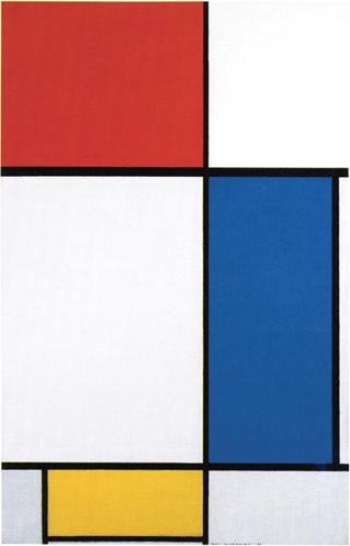
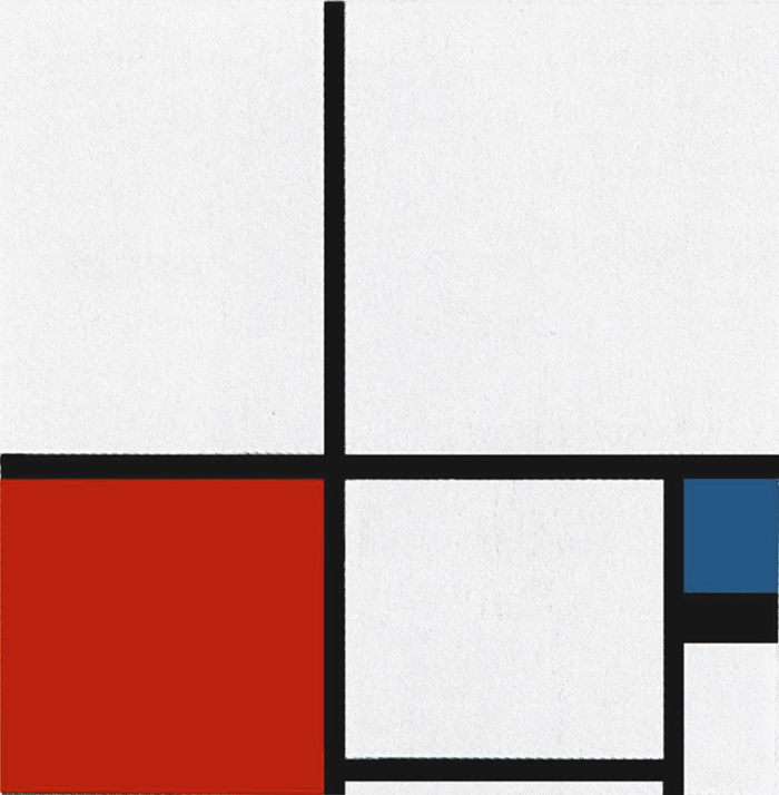
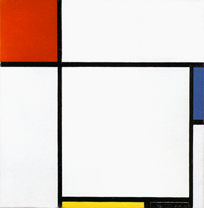
Square fields newly closed on all four sides also appear around 1927 in rectangular format canvases:
Komposition II with Red, 1926,
Oil on Canvas, cm. 50,8 x 50,8

Composition N. III with Red, Blue, Yellow, 1927,
Oil on Canvas, cm. 35,5 x 38
Composition with Red, Yellow and Blue, 1927,
Oil on Canvas, cm. 51,1 x 51,1
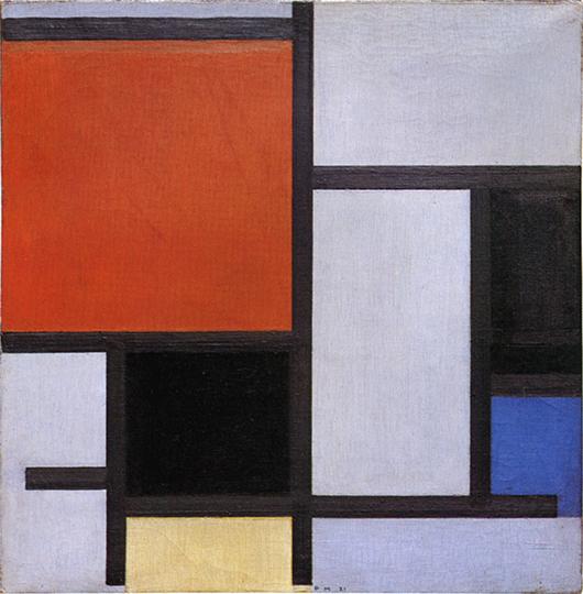
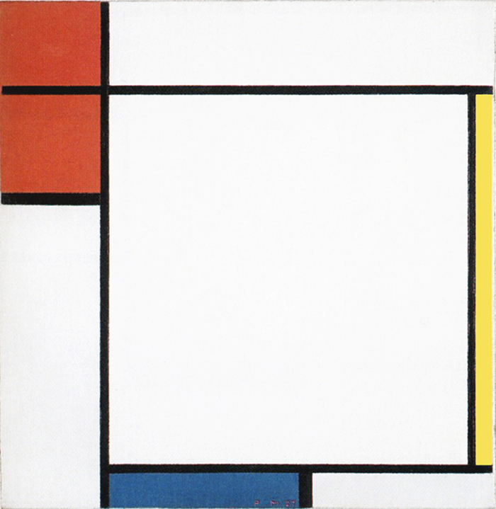
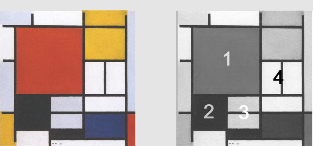
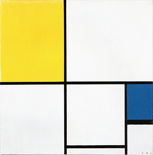
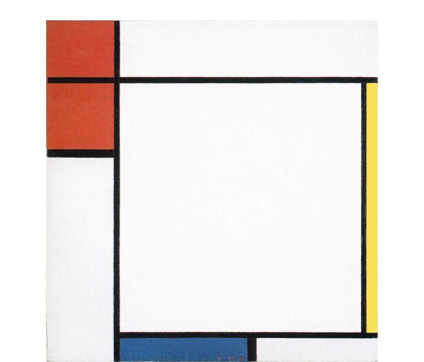
Whether open or closed, the large squares appearing in all the works produced during the first half of the 1920s are always counterbalanced by planes with a marked horizontal or vertical predominance as seen in Fig. 8 (plane red), in Fig. 9 (blue plane) or in Fig. 10 (yellow plane) but also by planes in which the imbalance between the opposing directions is reduced, i.e. attains proportions verging on the square as seen in Fig. 9 (the red plane) as well as in Fig. 10 (lower section of the red plane).
When they approach and/or attain the proportions of a square they seem intent on competing for the space with the large white square (Fig. 10), which therefore appears less absolute because the moment in which the opposites attain equivalence is no longer expressed solely through a single large white square but also in the form of smaller colored squares.
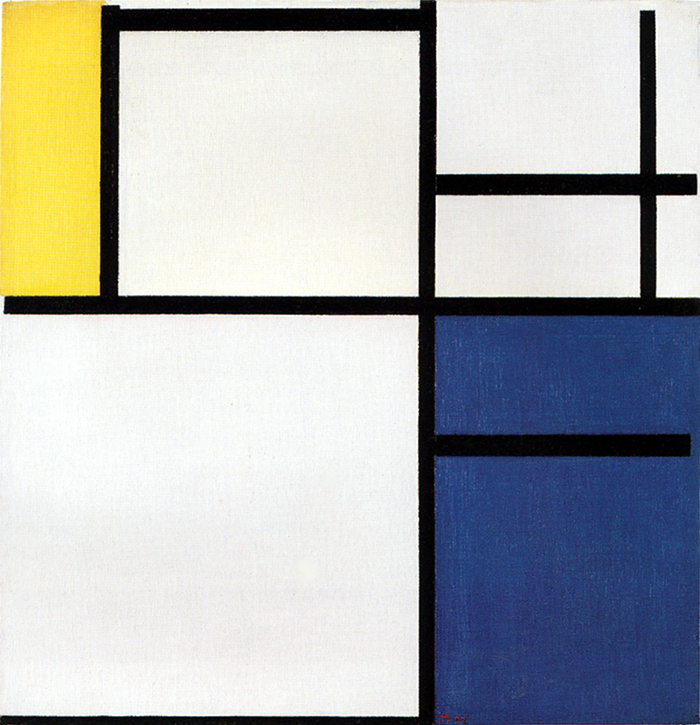
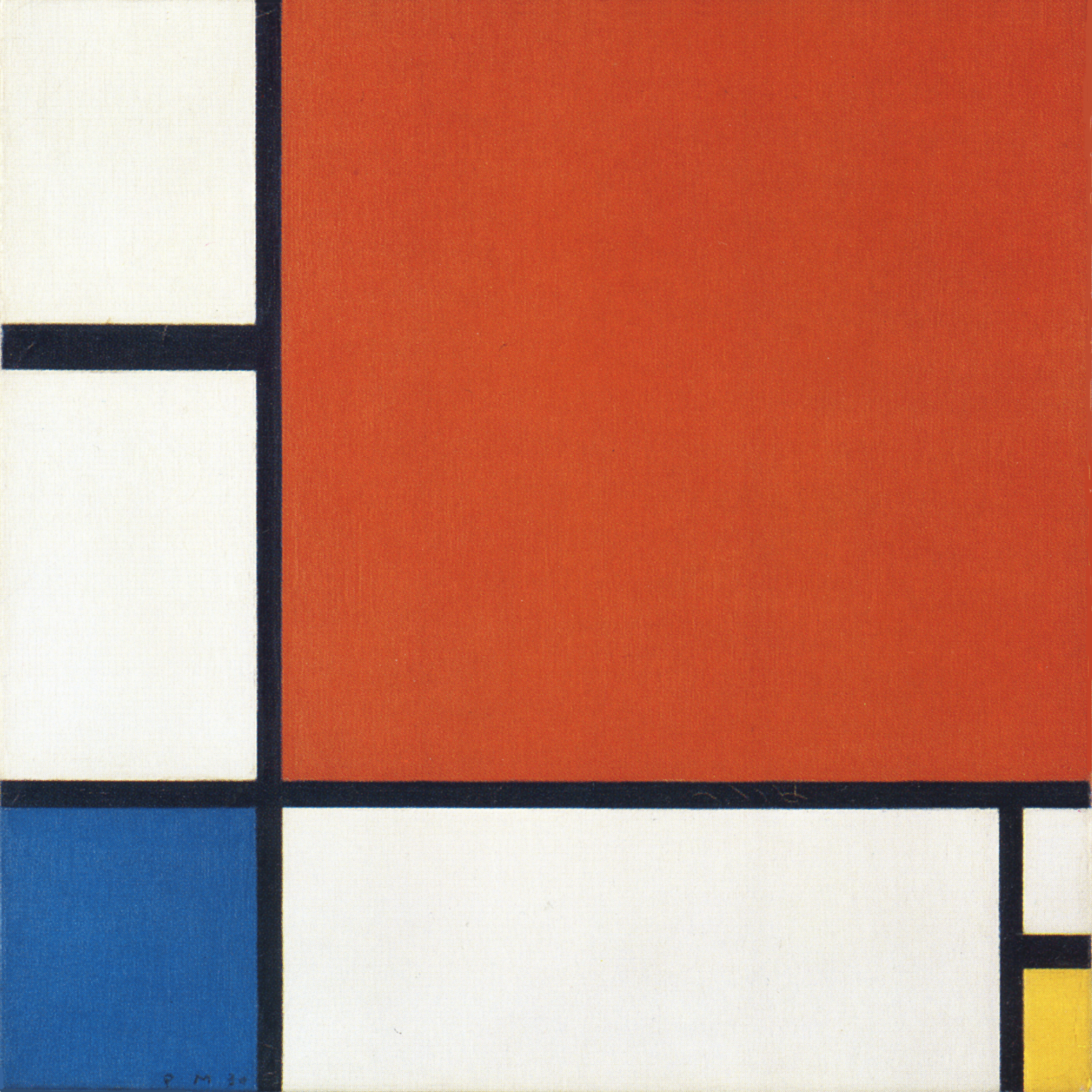
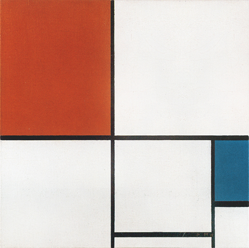
Composition with Red, Yellow and Blue
This work presents a vertical yellow plane with the proportions of a linear segment developing around a large area tending toward the square. We then see a horizontal blue area where the imbalance between horizontal and vertical is less marked than in the yellow, and finally a red field where the horizontal component increases again and the imbalance between the opposites is further reduced:
Composition with Red, Yellow and Blue, 1927,
Oil on Canvas, cm. 51,1 x 51,1
A horizontal line divides the red field into two areas, the lower of which presents square proportions while the other is a rectangle of greater horizontal development.
On rereading this as a single sequence, we see a vertical yellow plane that passes through a horizontal blue field, gradually attains an equilibrium of vertical and horizontal (the red square), and then opens up again to predominance, vertical if we consider the entire red area or horizontal with the red rectangle positioned above.
The marked predominance of one value gives way to a momentary equilibrium of opposite values that then opens up again to new forms of predominance and imbalance.
All this happens around a large white square that appears to constitute a sort of ideal and absolute equivalence of opposites which is otherwise attained by the various areas of different colors in a temporal and hence relative succession that could be described as reflecting everyday reality. The ideal vision of absolute equilibrium is expressed in white, a color Mondrian identified with the spiritual (the constant) while the relative vision developed in a space-time sequence is expressed with the three primary colors, which the artist identified with the natural that is, with the changeable in life.
A great date in his life will be 1926. That year he received a visit from Miss Katherine S. Dreier, who bought a large diamond-shaped canvas from him, which was exhibited again that year in Brooklyn at the International Exhibition of the Société Anonyme.
In the book which appeared on this occasion, and in which almost all the representatives of abstract art from all over the world had their place, the courageous organizer wrote: “Holland has produced three great painters who, while being a logical expression of their country, rose above it by the first was Rembrandt. the second was van Gogh, the third is Mondrian.
One realizes Rembrandt’s strong personality when one compares him with the men of his time, with men as great as Frans Hals. Van Gogh also contrasts strongly with Mauve, Israëls and the very good painters of his time.
And now here is Mondrian again, who, starting from this strongly individualistic expression, has reached a clarity that before him was never achieved. To have written this in 1926 is a great proof of clairvoyance and, in my eyes, an immense title of glory.
Michel Seuphor, Piet Mondrian, Sa Vie, son Oeuvre, 1956
Interpenetrating lines and square, infinite and finite
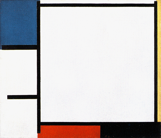
We spoke earlier of works in which the large square form opens up and its inner field expands beyond the finite area of the canvas. Let us now consider the following sequence of works. In Fig. 1 the large white field of square proportions is nearly all contained inside the perimeter of the painting. The large square expands toward the left (Fig. 11) and is mostly outside the canvas in Fig. 12, where the areas to be seen are in actual fact vertical rectangles:
Tableau X with Yellow, Black,
Red and Blue, 1925,
Oil on Canvas, cm. 42,5 x 49
Komposition IV with Red, 1926, Oil on Canvas,
cm. 30 x 40
Composition with Yellow and Red, 1927, Oil on Canvas,
cm. 35 x 52
If we, however, consider in Fig. 12 all the area of space between the two horizontal lines, we realize that it combines with the two vertical sides of the canvas to form a new shape tending toward an area of square proportions; a square with a vertical line running through it. The same thing is to be seen in some later works (Fig. 13 and 14):
Large Composition with Red, Blue and Yellow, 1928,
Oil on Canvas, cm. 80 x 123
Composition 1 with Red, 1931, Oil on Canvas, cm. 54,7 x 82,5
There is a vertical line running through the square in these new compositions.
Indications of infinite space (lines) appear inside the finite space (the square); the dynamic element (the line) penetrates the constant element (the square):
I have grouped the compositions with a large square closed on four sides into an A compositional layout while the new canvases with a square area crossed by a vertical line into a B layout. I have already examined some works pertaining to compositional layout A and shall now have a close look at three works based on compositional layout B:
Composition with Yellow and Red
Two horizontal lines and the two vertical edges of the canvas form a large square slightly more developed vertically which is left open on either side to continue with the two horizontal lines. The vertical line combines with the lower horizontal to generate a red rectangle and with the upper to form a small yellow square:
Composition with Yellow and Red, 1927,
Oil on Canvas, cm. 35 x 52
The two colored planes perform the function of accentuating the asymmetrical nature of the whole but also of emphasizing the square block of the central area in a complementary fashion, the red at the bottom occupying the part not filled by the yellow at the top and vice versa. Added together, the two colored planes would express the absolute continuity of the horizontal lines, which are instead disrupted and distanced by the intervention of the vertical.
It is necessary to imagine the two horizontals an instant before the appearance of the vertical, when they presumably formed a single line which splits in two by the sudden interaction with the vertical to form a white central block that works with the edges of the canvas to generate a square field.
The vertical line shatters the uninterrupted continuity of the horizontal, which thus shifts from an absolute to a relative condition in which one part appears as red and another as yellow; one is situated below and the other above; one partakes more of the horizontal (the red plane) and the other (yellow plane) slightly more of the vertical.
It could be said that the interaction between the vertical (symbolizing the spiritual) and the horizontal (symbolizing the natural) gives birth in the twinkling of an eye to different shapes and colors, just as the interaction between an observer and a natural landscape generates a variety of impressions that we concentrate into mental content.
As it remains open on either side, the space between the two horizontal lines is in a state of unstable balance between a square shape (if seen in relation to the edges of the canvas) and a rectangle expanding beyond the perimeter of the canvas toward a virtually infinite space evoked by the horizontal straight lines.
A relationship arises spontaneously between the red rectangle, the yellow square, and the larger, unstable square field in the central area, which would close up in the absence of the vertical line and revert to its prior state, with the horizontal lines reconnecting to form a single and absolute line of horizontal tension, red and yellow dissolving into white, and the relative again becoming absolute also in terms of color.
Large Composition with Red, Blue and Yellow
Fig. 12 leads to Fig. 13, where the layout is analogous but the resolution different.
Large Composition with Red, Blue and Yellow, 1928, Oil on Canvas, cm. 80 x 123
The vertical line is shifted further toward the center and two horizontal lines generate areas of different proportions including a large square in the central area which is divided into two vertical rectangles, one white and the other blue. We see a yellow plane in the lower section and in the upper section a red plane that works together with the blue one to give the composition a strongly asymmetric character.
A yellow horizontal rectangle becomes a blue vertical one and then a red area the opposing directions approach equivalence.
Moving upward from the bottom, the vertical line guides a development of the composition that shows the three colors and the opposing directions generating different and complementary situations that are then encompassed in the large square to be glimpsed between the two horizontal lines.
Equivalence is attained here for an instant between the opposite directions, while in terms of color the central square proportion partially absorbs color blue.
The square form appears to be torn between the blue rectangle, which pushes it from inside toward the right, and the yellow and red rectangles, that pull it from outside toward the left.
Composition 1 with Red
This canvas reiterates the compositional development of Fig. 13 while purging it of color. The only one of the three primary colors to be seen here is red, which acts as an accent, while most of the composition develops through a rhythmic arrangement of white planes:
Composition 1 with Red, 1931, Oil on Canvas,
cm. 54,7 x 82,5
In comparison with Fig. 13, the vertical line typical of compositional layout B is shifted still further toward the center of the canvas. Starting from the red plane and following the lower horizontal line, space opens up toward the right while being simultaneously pushed upward by the vertical, thus giving rise to a square area divided into a number of sections (Fig. 14 Diagram A).
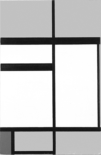
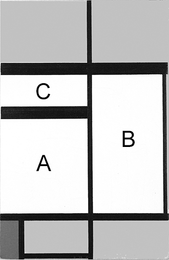
Fig. 14 Diagram B: In the large central square field we see a vertical rectangle (B), a horizontal rectangle (C), and one in which the opposite directions approach equivalence (A), which is finally attained in the large square field (Fig. 14 Diagram A) constituting a synthesis showing three different relationships between the opposite directions. Unity (the square proportion) unveils a certain degree of multiplicity. The constant unveils changeability.
The proportions of the small red plane are similar to those of the whole canvas. When we contemplate the variety present in the large square field, the red accent calls out to concentrate the manifold into a synthesis. It appears to be color more than equivalence of horizontal and vertical (the square) that works in this composition to maintain the unity of a space which diversifies and multiply.
The lines and segments present at least five different thicknesses. In some cases almost imperceptible, the difference in thicknesses helps to increase the level of multiplicity in a composition where colors have been reduced to a minimum.
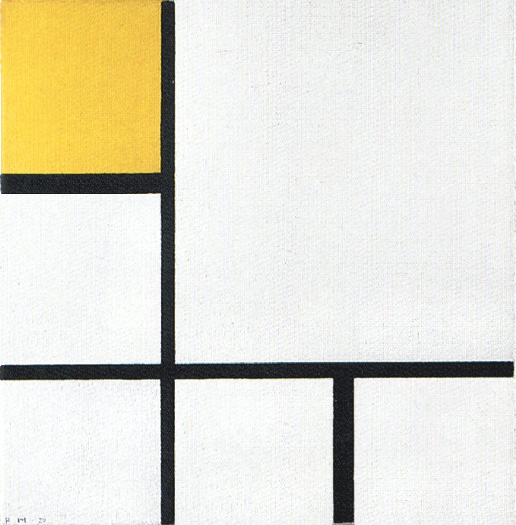
In point of fact, during the second half of the 1920’s Mondrian progressively reduces the elements, often working with white, black, and small accents of color:

cm. 50,5 x 50,5
Oil on Canvas,
cm. 46 x 46,5
While the elements are reduced, the painter increases their reciprocal diversity with subtle variations, as exemplified in several cases by the differing thicknesses of the lines. The whole is thus rich in nuances that help to evoke multiplicity while conveying a sense of unity; a dialectic to which the artist attached such importance, even in a space moving toward ever-greater synthesis.
As seen in the previous page, with a large square visibly structured and colored within, Mondrian had tried in Composition B to present a unitary synthesis open to multiplicity:
but in so doing the square area looses cohesion and unity and this is why the painter closes it again to an homogeneous white field momentarily:
and then opens it up again to differences in size, proportion, and color:
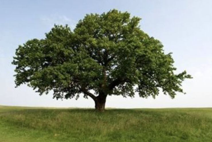
As mentioned, the goal is to compenetrate unity and multiplicity while keeping both aspects visible. This is because Mondrian believes that the two seemingly opposite aspects are actually the same thing observed now as one and now as multiple. Once again I recall the example of a tree observed from far (a synthetic green spot) and very close distance (an endless complexity).
A single leaf actually unveils a multiplicity of parts:
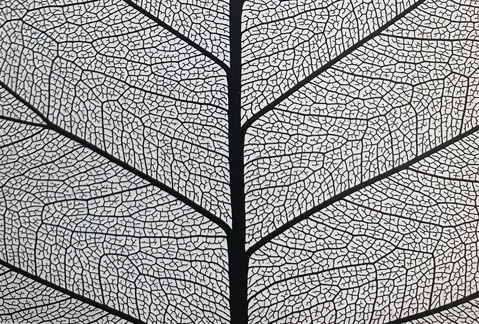
Unity and multiplicity are one and the same thing seen from different viewpoints in different moments.
This is why since 1915 after having reached unity the artist opens it up to multiplicity:
1915
Diagram
Pier and Ocean 5 shows unity (the central square) opening higher up to duality and then flowing back into the manifold space around. The initial multiplicity of imbalanced situations concentrate into a unity (a perfectly balanced relationship between opposites) and then unity reopens to a multiplicity of different parts.
This is, mutatis mutandis, what we are now observing in the Neoplastic compositions.
Mondrian’s hopes of being “recognized” in Paris were dashed.
In a letter written a little earlier, van Doesburg, who had just passed through Paris, wrote to a friend in Holland: “In Paris, everything is totally dead, Mondrian suffers a lot, and I know that he would recover if he only wanted to understand that in the Latin reactionary soil nothing new can grow. It is for me a certain fact that the new area of culture is the North.”
This idea was also dear to Fernand Léger at the time: “The new spirit comes from the North”, he wrote in head of an article. We would easily find some matter for discussion, fed by all that has happened since then in the field of art … and politics.
Michel Seuphor, Piet Mondrian, Sa Vie, son Oeuvre, 1956
New compositions
As highlighted in previous pages, almost all of the works Mondrian created between 1920 and 1936 can be grouped into four basic compositional layouts:
The guiding thread of all the works based on these four compositional layouts is a progressive interpenetration of the square proportion representing unity and the planes which present a variety of proportions and colors, that is to say, changeability and multiplicity.
The interpenetration continues with new compositions:

In these new works the lines acquire greater autonomy and the compositions become more dynamic.
In the canvases that followed layout A the lines can in fact almost be seen as framing the large square that occupies most of the central area and thus inhibits their dynamic continuity. In the new works based on Layouts C and D the square instead seems to be generated by the space of the lines and to share their infinite quality. This is a feature that had already appeared in some lozenges.
Katherine Dreier returned to Paris the following year and bought several Mondrian paintings again. Then came Germans, Swiss and other Americans such as Mr. Gallatin who had just founded the Museum of Living Art. But Mondrian sold his paintings at very low prices and, if the ordinary had improved a little, the end was never near without causing him some anxiety.
In spite of everything, the painter had happy days in Paris. He was surrounded by solicitous friends (the Stieltjes and Hoyack families, for example, the Vantongerloos, Dr. d’Eck, myself), he received many visits from Holland, sometimes from wealthy people who invited him to a good restaurant or to some fashionable dance hall.
At the beginning of 1930, in the Cercle et Carré group that he had founded with Torrès-Garcia and that had eighty members, he was admired and revered. In spite of his discretion and natural self-effacement, he was the spiritual center of the group.
Michel Seuphor, Piet Mondrian, Sa Vie, son Oeuvre, 1956
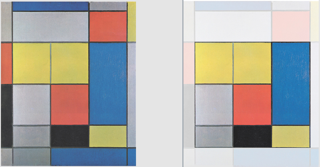
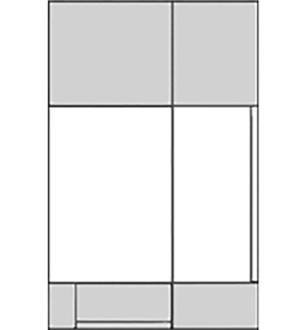
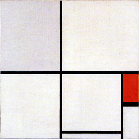
Between 1927 and 1929 the large white square field originating from Layout A (Fig. 10) decreases in size and moves toward the lower right corner leaving space for a second square colored red in the upper left corner (Fig. 15) or in the lower left corner (Fig. 16):
Composition with Red, Yellow and Blue, 1927
Composition with Red, Blue, Yellow and Black, 1929

Composition N. III with Red, Blue, Yellow and Black, 1929
This tendency gave rise to what I have called compositional Layout C.
Layout C is born out of the meeting of two perpendicular lines that run through the center of the canvas to generate four areas with proportions not too far removed from equivalence. The lower right area is further divided by three segments that work with the two lines to produce a white square field closed on all four sides and a smaller colored plane to its right:
Further compositions based on Layout C will be examined in detail on the next page.
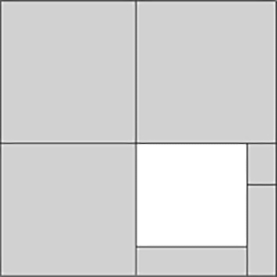
In a different way, but with same purpose of diversifying the unity evoked by a predominant central square (Fig. 10) the compositions based on Layout D display the tendency to reposition the large central square toward the top right corner and make way for a smaller second square in the opposite bottom left corner (Fig. 17) or for additional small squares (Fig. 18 and Fig. 19):
Composition en Rouge, Bleu et Jaune, 1930
Composition 1 with Yellow and Light Gray, 1930
Composition with Blue and Yellow, 1932
All the squares are now open on one or two sides.
The first obvious difference between canvases based on Layout C and those following Layout D is that on the former we see a single square field that is white in color and closed on all four sides while on the latter the squares are open and often colored:
Once again this demonstrates how the artist wishes to open up and interpenetrate unity (the square parameter) with multiplicity (the changing set of different sizes, proportions and colors) evoked in Layout D without, however, losing sight of the one as seen in Layout C.
On the next page we shall examine additional works of both Layouts C and D.
Next page: Neoplasticism – Part 3
back to overview
Copyright 1989 – 2024 Michael (Michele) Sciam All Rights Reserved More