Please note: If on devices you click on links to images and/or text that do not open if they should, just slightly scroll the screen to re-enable the function. Strange behavior of WordPress.
Refining Neoplastic means
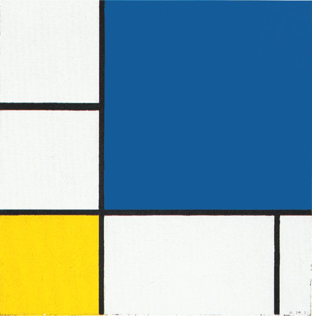
We examine here some works Piet Mondrian created between 1930 and 1933. With these compositions the artist continues to refine the most suitable plastic means aimed at making visually concrete his concept of every complexity turning into a unity and the unity as manifold as possible.
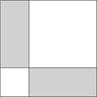
We shall start analyzing works pertaining to the compositional Layout C which appears to have developed out of the vertical line that comes to occupy the center of the canvas in Layout B:
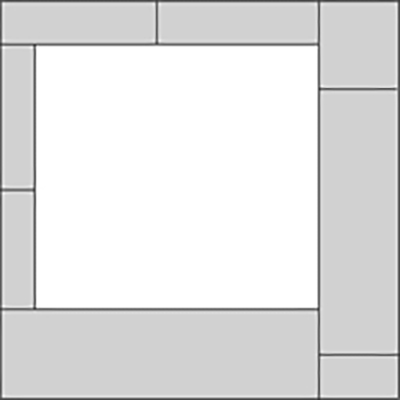
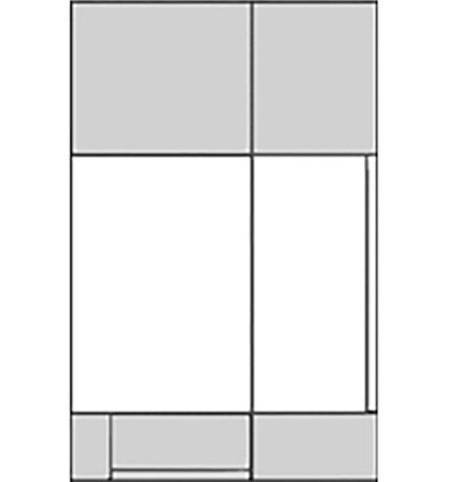
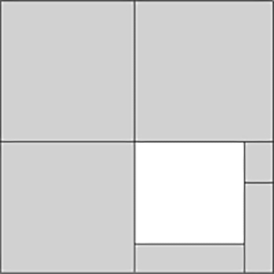
The peremptory presence of the large square, which occupied the center of the composition around 1921 (Layout A), gives way first to a vertical line (Layout B) and then to two perpendicular lines (Layout C).
Where there was once a finite space (the square of Layout A), we now see a space that continues uninterruptedly (the lines). This makes the center of the canvas more dynamic.
The central area of the canvas has always played a crucial role in Mondrian’s compositions. Recall the base of a plate, the rectangle, the drawn square and the painted white squared area or the white rectangle and the large square form. All this always involves the central area of the composition. With the new works based on Layout B and Layout C, Mondrian appears to have felt the need to inject greater dynamism into the center and with it the equivalence of opposites (the square) and the composition as a whole.
Composition with Yellow
The two perpendicular lines seem intent on pulling the square unit upward and to the left, while the accent of color rebalances everything to the right.
The composition is in dynamic equilibrium between a virtual infinite space (the expanding opposite lines) and the same space which momentarily concentrates into a finite relationship expressing balance and unity between opposites (the square proportion):
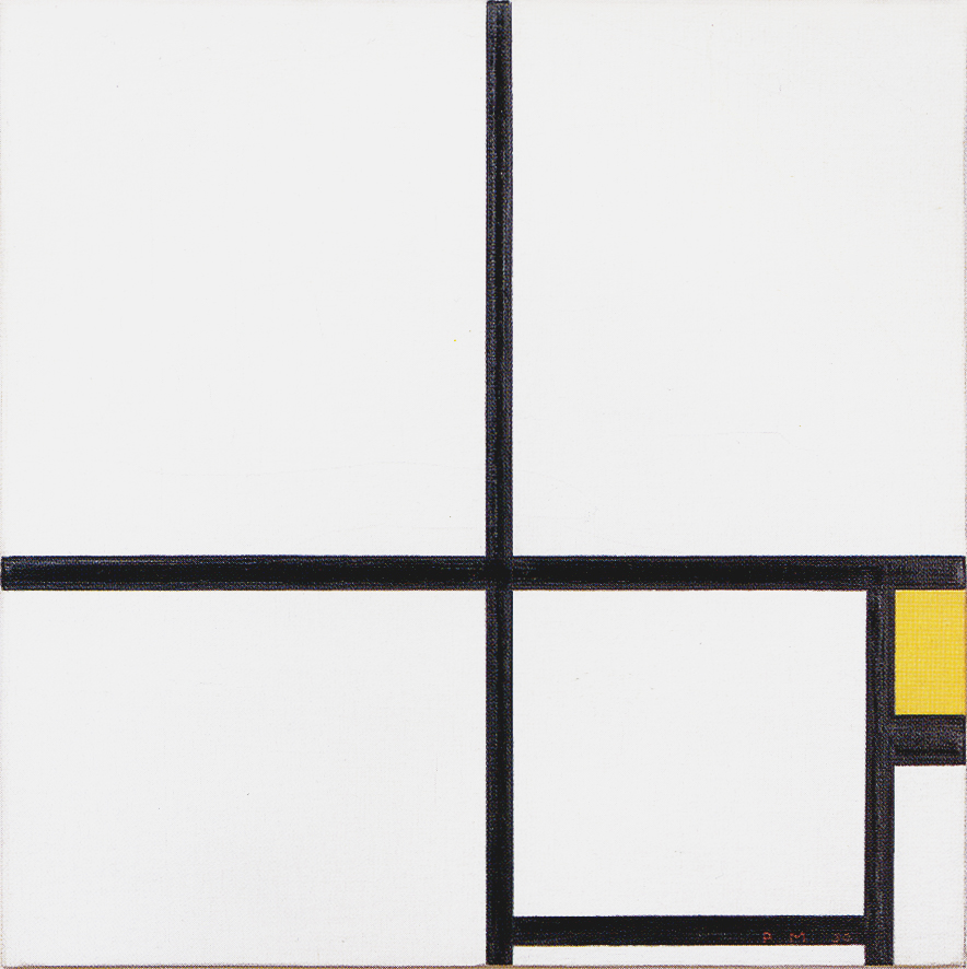
Composition with Yellow, 1930,
Oil on Canvas, cm. 46 x 46,5
Each individual line which tends to disrupt that balance. How often the integrity of our being is jeopardized by sudden imbalances between opposing drives that animate our inner life and/or arise between us and the outer world.
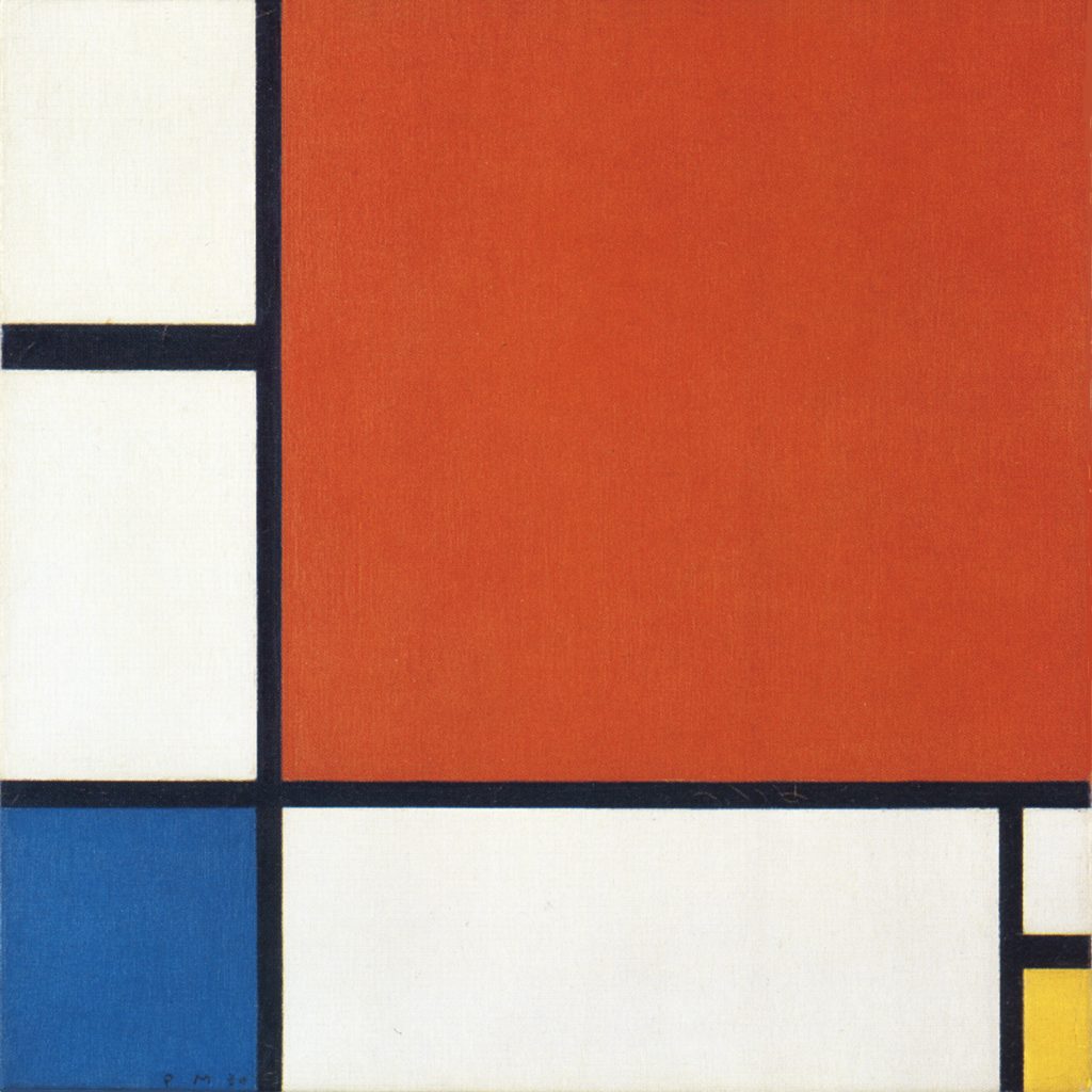
Composition II with Blue and Yellow
Rectangular and approximate square areas of different size, proportion and colors appear in unstable equilibrium between the infinite extension of the lines and the finite space of the canvas. These areas therefore appear as finite and infinite at the same time:
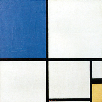
Composition II with Blue and Yellow, 1930,
Oil on Canvas, cm. 50,5 x 50,5
The interaction between finite and infinite space makes the fully enclosed square appear uncertain. Our quest for balance and unity (evoked by the square) is challenged by the unforeseeable dynamism of life (the endless lines).
Undefined squares
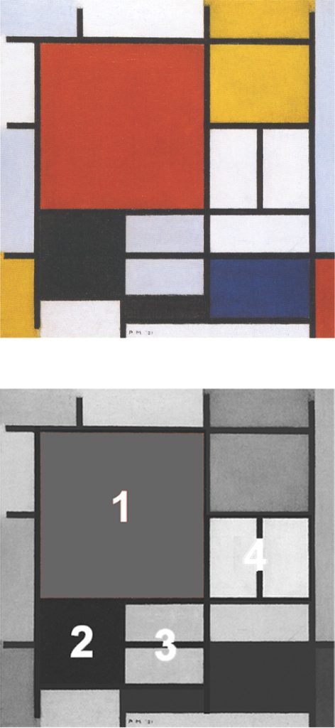
Fig. 3 presents four areas verging to the proportions of squares (1, 2, 4). These are fully accomplished in 2 which however remains open to the left and to the bottom and is therefore subject to the expanding action of the opposite lines:
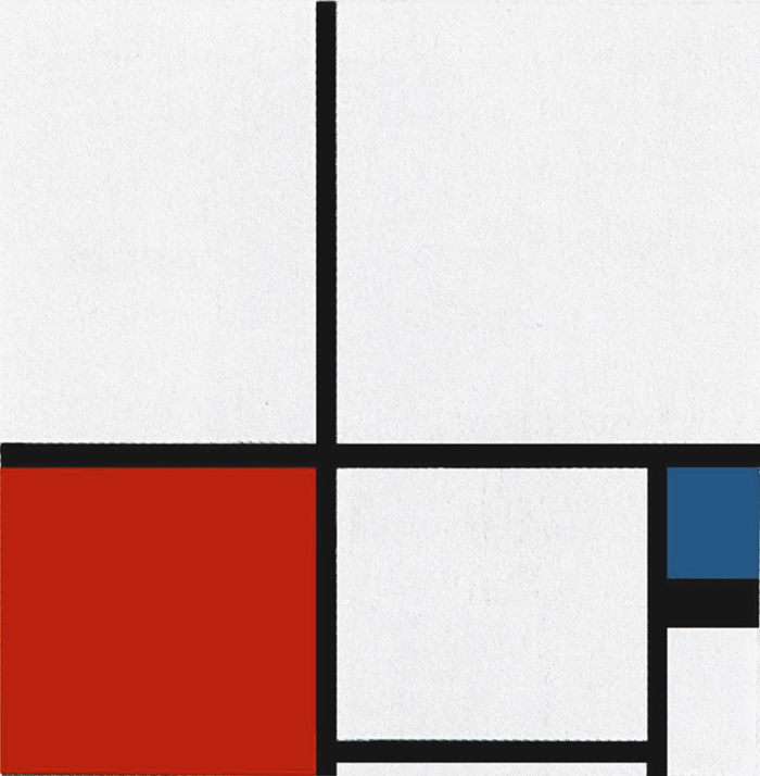
Composition 1 with Red and Blue, 1931, Oil on Canvas, cm. 50,5 x 50,5
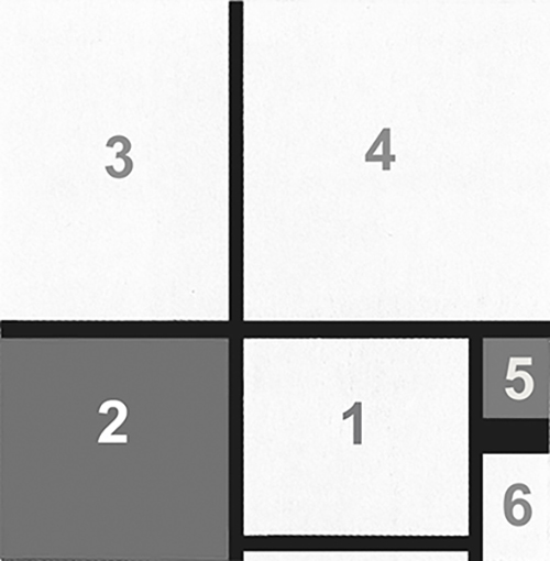
Diagram
The closed area 1 appears as the only finite element (a slightly horizontal square proportion to compensate for the vertical prevalences of areas 3, 4, 5, 6).
Uncertain balance and undefined unity
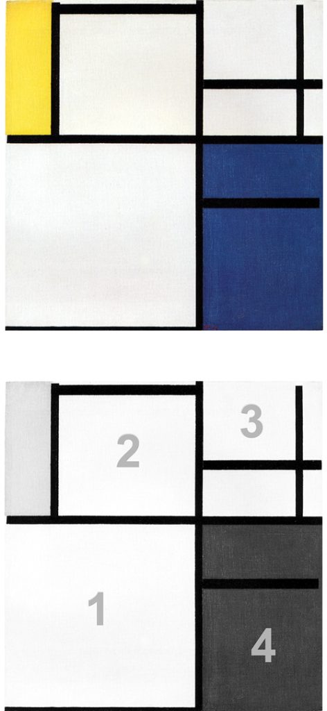
Fig. 4: We again see here some areas tending to square proportions (Fig. 4 Diagram) while others show a prevalence of one direction over the opposite. Area 2 appears as a square which remains open at the bottom and to the left while area 3 opens toward the top and to the right.
As mentioned in describing other works, areas 2 and 3 extend beyond the canvas and it is therefore the finite perimeter of the painting which makes us perceive these two areas as square; in point of fact they could extend well beyond the canvas; these are quite undefined squares:
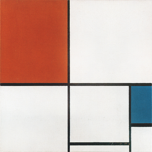
Composition A with Red and Blue, 1932,
Oil on Canvas,
cm. 55 x 55
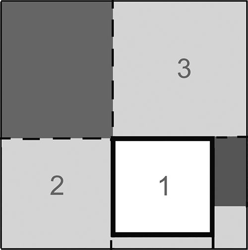
Diagram
Area 1 is the only fully accomplished square closed on four sides. This connection between a completed square and a series of open, uncertain squares reminds the relationship between a central, fully attained square and a number of open, undefined squares to be found all around the central one in Pier and Ocean 5 of 1915. The red and the blue areas in Fig. 4 unpredictably extend beyond the canvas as well. This means that they could be square proportions of which we see only a part. On observing these works, we are faced with elements that simultaneously remain and change.
The red and blue planes show unbalances between horizontal and vertical. They are plastic symbols of the mutable appearance of life (the Natural) whereas the white open squares (2 and 3) suggest the on-going search for synthesis and balance (the Spiritual) which is finally fully achieved with area 1 where opposites reach a relatively stable and well defined unity. Unforeseeable and ever-changing events (the colored planes) gradually (2 and 3) become certain and relatively constant (1); the Natural turns Spiritual.
The lines, which continue beyond the canvas, seem to connect with the far more complexed real world the painting is a part of; a part which aim at ideally concentrating the essence of the whole.
Composition with Blue and Yellow
The same thing can also be seen in Fig. 5 where we observe a closed square form showing a slight vertical predominance.
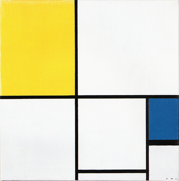
Composition with Blue and Yellow, 1932, Oil on Canvas, cm. 55,5 x 55,3
An interaction between the virtually endless lines (infinite space) and the white and colored areas, i.e. the relationships established between the lines (finite space) generates a variety of elements that, together with the visual weight of the colors, create a dynamic balancing of the whole.
A slice of definite space (the closed square) coexists with slices of indefinite space which may change a moment later. The painter appears to have wished to express a variety of possible unitary syntheses before or after they reach full balance, that is, to open and multiply the one to the many; contaminate the certain with the uncertain.
Multiplying unity
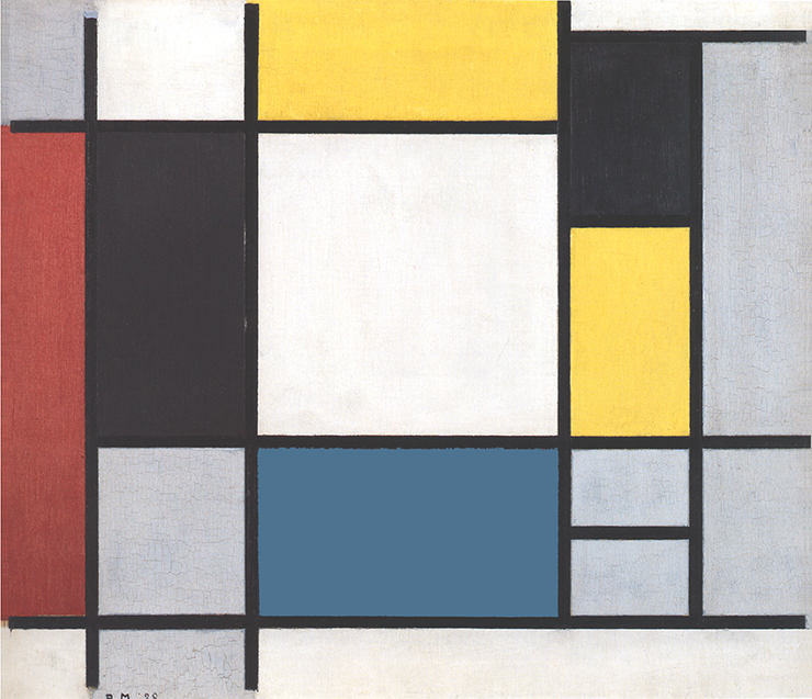
A tendency to multiply and color the synthesis was displayed in some works as early as 1921, e.g. both works shown below, where the equivalence of opposites (the square unit) is expressed through four different areas verging to square proportions:
While in the above examined works based on Layout C the square unit opens up and multiplies mainly through form, in the coeval canvases based on Layout D the square multiplies above all through color (Fig. 6, 7, 8):
A large red square and a smaller blue square appear to contend for the space in Fig. 6 whereas in Fig. 7 a small yellow plane or a black horizontal segment serve to redistribute the weight and keep the composition in a state of dynamic equilibrium. A variety of squares is to be seen in Fig. 8 including two in color and two in white, one large (blue) and three smaller (yellow and white).
The interaction between virtually infinite lines and the space contained within the perimeter of the canvas generates the proportions that work together with the weight of the colors toward a dynamic balancing of the whole.
The space of these compositions is markedly asymmetrical but everything is kept in perfect equilibrium. It does the mind good to think that an asymmetrical set of different elements can be resolved in a harmonious space. If only this could be achieved more often in social life.
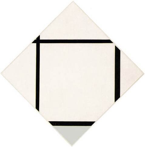
Composition 1 with Yellow and Light Gray
Fig. 7 is based on the interaction of two perpendicular lines and two segments, which generate six planes tending toward square proportions.
They all differentiate from one another through barely perceptible variations in their proportions. One is larger (with a slightly greater degree of vertical development), one is yellow and others white or grayish-white:
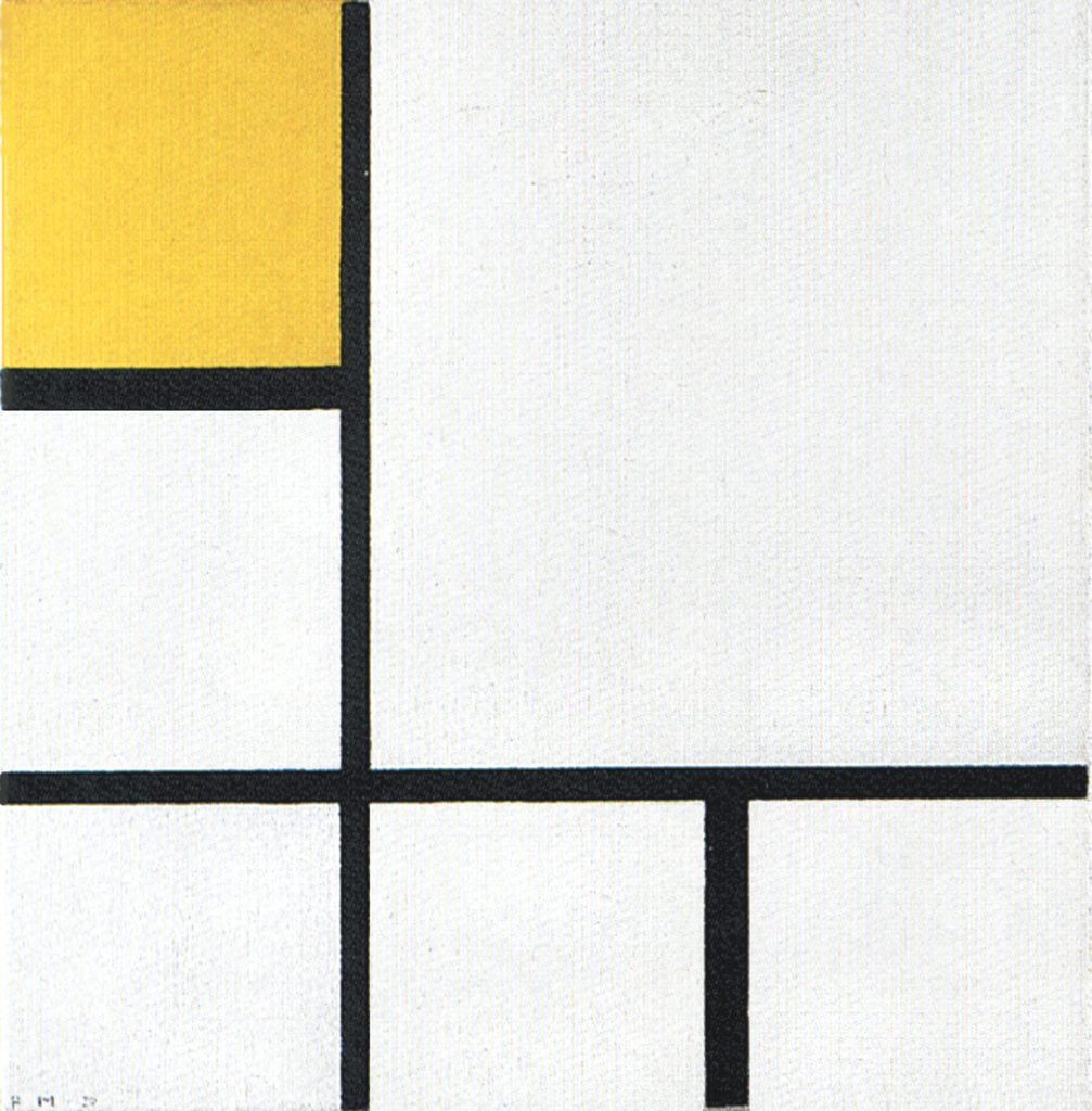
Composition 1 with Yellow and Light Gray, 1930,
Oil on Canvas, cm. 50,5 x 50,5
The horizontal line is slightly thicker than the vertical. The two segments are visibly thicker than the two lines and have greater weight, especially the vertical one, which also serves as a counterweight in the lower right section to the visual weight of the yellow square in the upper left section. The segments act as intermediaries between the dynamic and virtually infinite lines and the relatively stable and contained space of the squares which, however, tend to expand beyond the perimeter of the canvas as well.
While the lines “run away”, something remains to generate a variety of approximate square fields on the point of change. The three squares in the lower section appear similar and more balanced than the others, which instead develop a slight vertical predominance. The three squares in the lower section appear similar but in fact they differ: The square on the right has a thicker side on the left that in the center square is instead found on the right while in the square on the left the thicker side is on the top. The message seems to be that there is nothing more different than entities that appear to be almost the same.
In the above compositions based on Layouts C and D we are confronted with the idea of a probable but not entirely defined square.
Neoplastic space evolves
Neoplastic space evolves between 1920 and 1932. On the one hand, the closed square of layout A opens up and becomes more dynamic with layout B where a vertical line runs through it:
Click on images to see samples of the respective paintings:
On the other, the field inside the square remains whole with layout C but is reduced in size and exposed to the dynamic influence of two lines running through the center of the composition. With layout D the large square splits in two appearing now in red and blue or blue and yellow and opens up on two sides.
As has already been widely discussed, the common denominator of the three new layouts is the effect of making the equivalence of opposites more dynamic.
Mondrian often mentions the idea of “a dynamic equivalence of opposites” and if by opposites we mean the duality that moves the human soul, it becomes clear that neoplastic geometry is more than just an exercise in forms and colors.
It should be pointed out that the schemata I use here for explanatory purposes (Layouts A, B, C, D) are to be understood as interpretative models that can clearly be applied to Mondrian’s work but in no way exhaust it. They must be seen in an open and flexible way. The work proceeds as a single corpus and we can find combinations and overlaps of the various layouts that constitute different solutions to a single need, namely to express in a dynamic form the equivalence of opposites, that is, the square proportion.
Mondrian made sketches and used them as a basis for the compositions he wished to produce. These sketches were, however, like variations on a single inner design that took different forms on emerging at his fingertips. The painter proceeded intuitively and the schemata used in this explanation should not distort what was actually a highly articulated, fluid, uninterrupted process.
Intuition more than cool elaboration
With respect to the works of 1920-22, the primary colors display saturated tonalities in the canvases of 1928-32. The greenish yellows of the early 1920s have become fully yellow. The composition seems to undergo distillation and deft calibration in some of these canvases.
The parts express an intimate sense of permanence and duration while everything is nonetheless on the verge of flux and motion. The impending inconstancy of life transforms our equilibriums, our definite squares, into variable entities. The play of equilibrium regards not only form but also very subtle vibrations of color. The planes appear to have been painted there and then, thus suggesting intuition more than cool elaboration. The fields of red are splendidly rendered, as indeed are those of white, which have none of the flatness unfortunately seen in reproductions.
There are extremely subtle variations of every primary color, as there are of every shade of gray. As H.L.C. Jaffé wrote: “The painter let himself be guided by his feeling for color and rhythm, and he made alterations and corrections as he worked; over paintings to change the color of some of the areas can still be detected. The skilled treatment and masterly balance of the canvases are the result not of a theory but of a long experience as a painter.”
It is not easy to give an adequate description of the painterly quality of these canvases, the masterly combination of hues, the fine textural layering, or touches such as a sparkling note of yellow. It is also and perhaps above all essential to see the original canvases, which are endowed with energy that no reproduction will ever be able to convey, energy imparted by the man who brought them lovingly to life.
Michel Seuphor describes the canvases of the period 1928-30 as classic Neoplasticism, perhaps because nearly all the planes in these works approach square proportions, unlike the compositions of 1921-22. Some of these works are indeed authentic little masterpieces.
The lozenge compositions
A further variation on the theme of the painter’s drive for a dynamic transformation of the equivalence of opposites is to be found in the lozenge compositions Mondrian produced between 1921 and 1933.
The choice of the lozenge format makes it possible to use lines of various lengths. New relations of tension are established between the orthogonal planes and the diagonal sides of the painting. This gives greater breadth to the composition; the four corners of the lozenge generate a centrifugal energy and seem to expand the plane of the canvas along its two median axes. The lozenge therefore already seems in itself a way to make the equivalence of opposites, i.e. the square, more dynamic.
We have already examined four of the ten lozenges painted during those years:
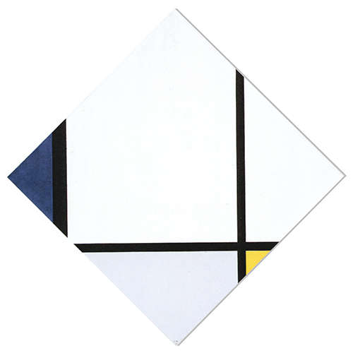
We shall now examine other two lozenges, which Mondrian produced at the same time as the rectangular canvases we have just discussed:
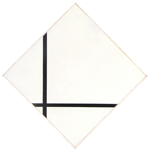
Lozenge Composition with Two Lines, 1931, Oil on Canvas, cm. 80 x 80
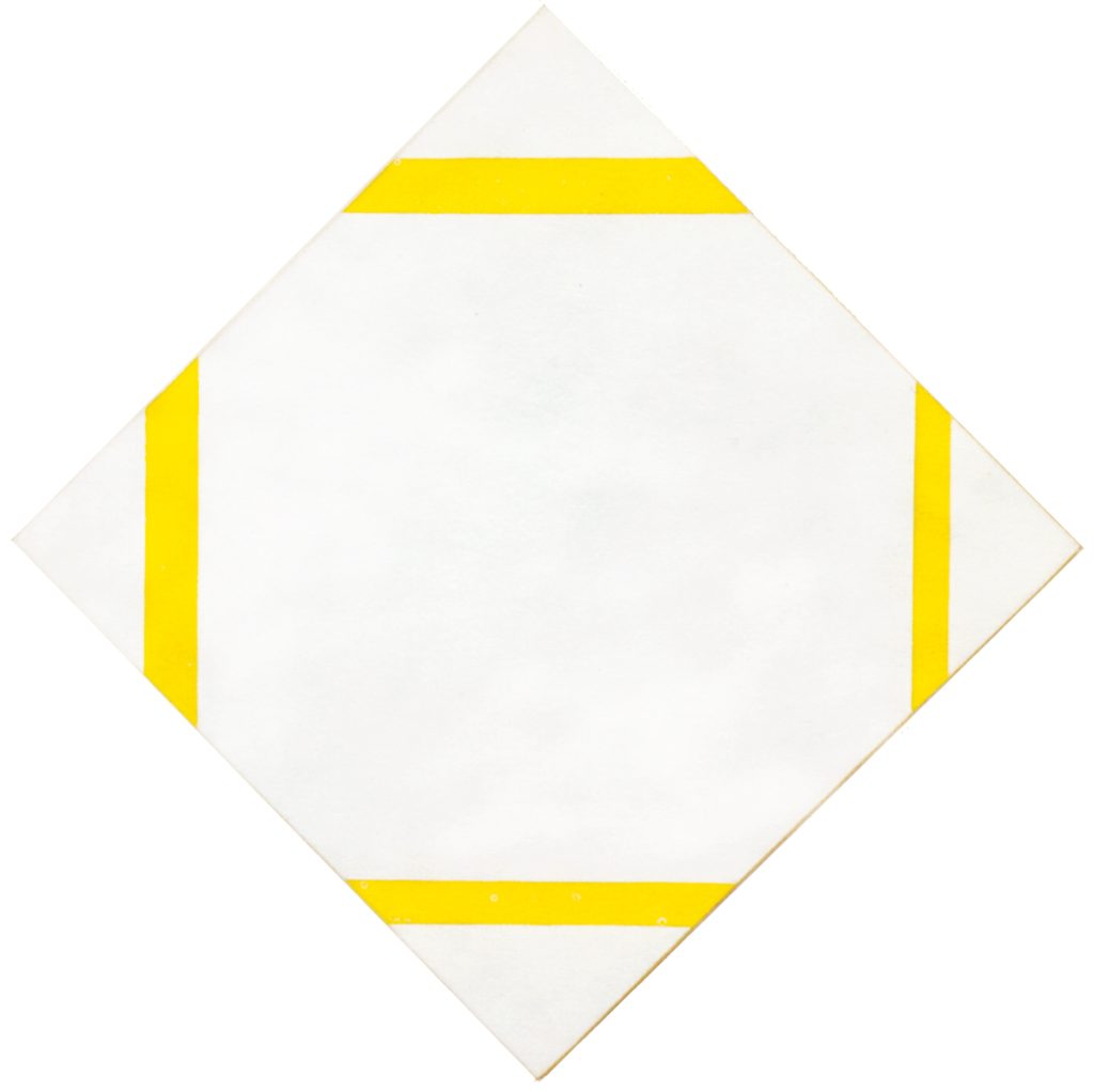
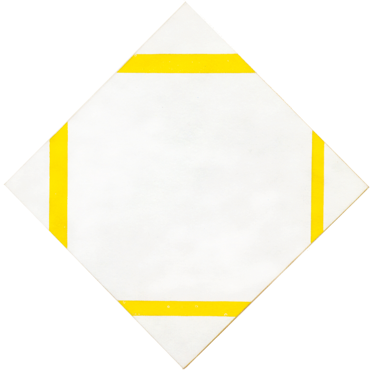
Lozenge with Yellow Lines, 1933, Oil on Canvas, cm. 80,2 x 79,9
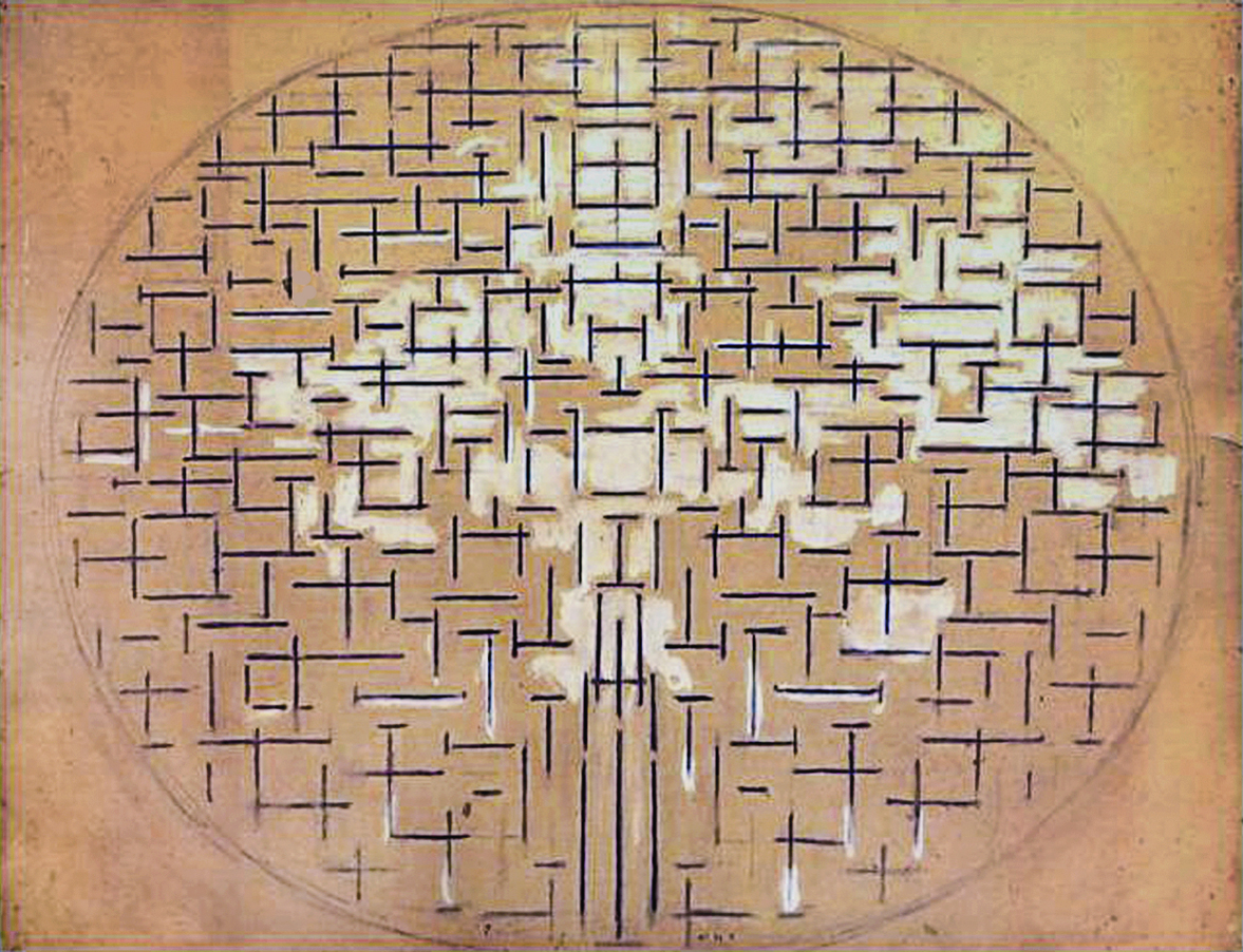
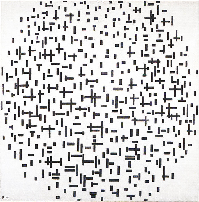
The artist seeks in these compositions to open and expand the square while maintaining its visibility at the same time. The concept of space here is still essentially the one that inspired his work from the very beginning: opening up to variety and mutability on the one hand while tending to concentrate on the other and thereby generating a more constant synthesis to which the human soul aspires. The synthesis should then re-open to the endless variety and mutability of life and this is what we have seen since 1915 with Pier and Ocean 5 where a square, symbol of unity, opens up to multiplicity.
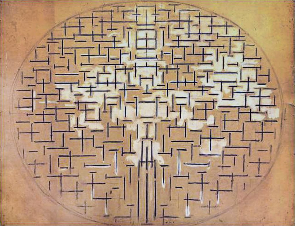
In Pier and Ocean 5 the unity expressed by means of an oval is replaced with a unity taking the shape of a relationship between horizontal and vertical (the square field).
From then on, the oval is projected beyond the finite field of the canvas to coincide with the reality of the world, of which the work of art constitutes a part:
With the gradual withdrawal of the oval, the square of 1915 remains inside the painting as the subjective symbol of an assumed but no longer visible objective unity (the oval).
If the subjective unity (the square) is to symbolize the objective unity (the totality expressed by the oval), the square will need to evoke its endless multiplicity.
This is why the entire body of work Mondrian creates in the course of the 1920’s shows the interpenetration of the square (equivalence of opposites) with all sort of imbalanced relationships between horizontal and vertical as well as with yellow, red and blue. The square unit opens up to multiplicity, that is to say, it opens up to the infinitely varied space of the oval.
The square opens up to the many but at the same time should remain identifiable as one. In point of fact, after seeking to open the square up to colors, the painter closes it again to an homogeneous white field momentarily, and then opens it up again to differences in size, proportions, and colors.
With the lozenge compositions Mondrian endeavors to open up unity to multiplicity by operating exclusively on the one, i.e. on the square, which is opened to the point of practically coinciding with the virtually infinite space of the lines, in other words, with the oval.
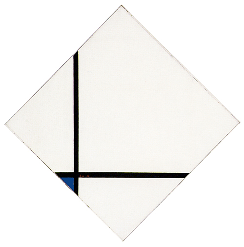
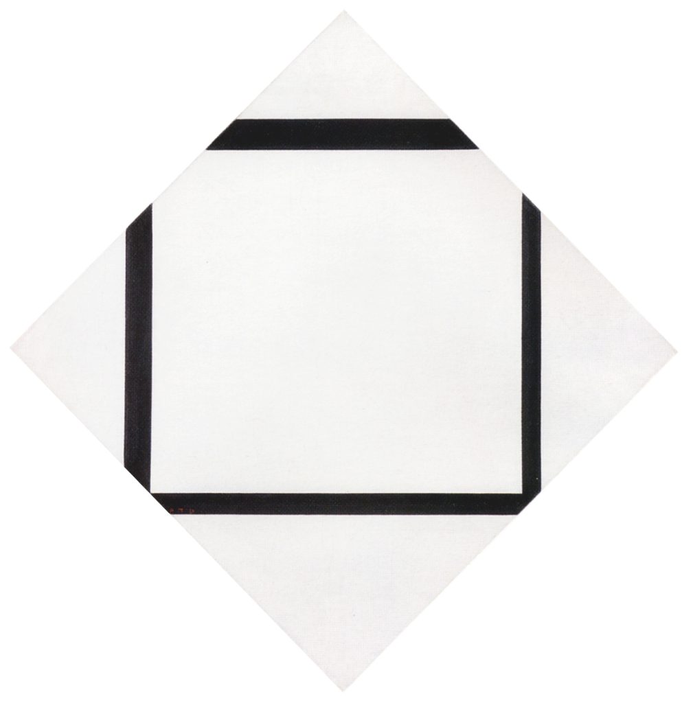
The peak is reached with Lozenge with Two Lines of 1931:
Lozenge with Two Lines
We see here just two opposite black lines which allude to a “square field” that can barely be intuited, a square that is no sooner generated than it becomes an infinite space:

Lozenge Composition with Two Lines, 1931,
Oil on Canvas, cm. 80 x 80
The top and right corners of the lozenge accentuate the dynamic expansion of the central field. The space of a presumed square is no longer delimited by the lines but extends with them far beyond the canvas. Finite space almost seems to coincide with infinite space. The subjective unity (the square) extends so as to encompass ideally all the multiplicity of objective space that the canvas can never contain (the oval).
It is like the squaring of the circle.
These lozenge compositions constitute the moment of greatest correspondence between the one and the many. One could say that the square and the oval of Pier and Ocean 5 tended now to become one and the same thing.
Lozenge with Four Yellow Lines
After the extreme synthesis observed in Fig. 9, we see here a square that again appears to be defined by four sides but extending partially beyond the edges of the painting.
The square in this lozenge has the same proportions as the canvas:

Lozenge with Yellow Lines, 1933,
Oil on Canvas, cm. 80,2 x 79,9
The four lines show a progressive increase in thickness as we move clockwise from the vertical on the right. The increase in the thickness of the lines can be seen as the vertical incorporating a slight horizontal expansion or conversely as the horizontal growing thicker in response to barely perceptible vertical pressure. For a fraction of a second, the space of the lines is simultaneously vertical and horizontal, i.e. a synthesis of the opposite directions. From this point of view the lines seem to transform into embryonic planes. Ten years later the lines of Broadway Boogie Woogie will become planes and the planes will then revert to lines.
Invisible unity
We talk about a square that we actually do not see in full since the lines never meet inside the canvas. In point of fact each line could well continue on its own towards infinite space without being really concerned to relate with the opposite lines as to give birth to a square proportion. We are confronted here with a relationship between endless lines (suggesting infinite space) and a finite square resulting from an alleged meeting of the four lines beyond our field of vision.
The variable thickness of the lines, suggest in abstract terms, i.e. in essential terms, the mutability of our world while the virtually endless lines suggest an infinite reality our reality (the visible parts of the lines) is only a part of.
“Reality is not as it appears to us” explains scientist and philosopher of science Carlo Rovelli in his book of the same name. What we usually identify as real is just part of a broader spectrum of reality. Our senses do not grasp the microcosm that generates and is the substance of everything we actually see.
In his writings Paul Klee says that “art makes the invisible visible“.
The so-called realistic or figurative painting, grasp only that part of reality that we can usually perceive. By abstracting from the common appearances, that is, from a partial reality, painting can evoke in its own ways the visible and the invisible, that is, what Piet Mondrian calls “true reality”.
The more important innovation in Lozenge with Yellow Lines is obviously the fact that, for the first time, the lines are no longer black but yellow. The field is uniformly white and the yellow shape almost appears to be born out of the white rather than in opposition to it, as in the case of the black. Yellow is an intermediate value between black and white, sufficiently dark to be differentiated from white but, at the same time, not so radically opposite as black.
The opposite values now seem communicate and achieve unitary expression in terms both of form and of color, with horizontal and vertical simultaneously present for an instant in every line and the synthesis of black and white in an intermediate color, which yellow appears to constitute in this case.
A dynamic square
On observing this square and contemplating the differing thickness of the lines, we are faced with a unity undergoing transformation from one side to the other; a synthesis that already appears comparatively manifold in itself. We perceive a unity that tends to become rather than to be. It endures but changes at the same time; a square that is open, dynamic, asymmetric, and entirely expressed by color.
This composition goes to the heart of the problem: to show the manifold in unitary form; to open up unity, i.e. the postulate of consciousness, to the changing aspect of the natural universe and existence in time but without losing sight of it. This is a fundamental issue: The one and the many appear as antithetical realities in the human dimension; in actual fact, they are the very same “thing”.
One and the same thing
The dialectic between unity and multiplicity continued throughout the 1920s and early 1930s. The single white square field (1920) took on color, underwent duplication while opening up on one or two sides (1930) or remaining closed while developing out of the dynamic continuity of the lines around 1931:
The square unit is sometimes more horizontal, sometimes more vertical; sometimes larger, sometimes smaller; sometimes blue, sometimes yellow. The single enclosed square of 1920 gradually gave way to a variety of open and not fully defined square forms.
In actual fact, the square opened up and interpenetrated with the variety of forms and colors in the rectangular canvases while seeking in the lozenge compositions to absorb that variety with no extensive change to itself.
In the first case, the square opens up in the direction of multiplicity; in the second, the square absorbs multiplicity (the changing thickness and virtually endless continuity of the lines) while remaining substantially one:
In the rectangular canvases on which the painter worked at the same time as the lozenges, the square evoking unity progressively opens up to a variety of measures, proportions and colors, but never attains expression with such a degree both of articulation and of synthesis as in this lozenge of 1933.
With the canvases of the late 1920’s and above all with this lozenge of 1933, the artist appears to have given material expression to an idea that had guided him, canvas after canvas, for roughly twenty years of work, namely to express the multiple in unitary form and endow it with the stability required by consciousness without, however, causing it to atrophy in overly rigid and constant geometric forms. The artist felt for a moment that he had achieved his objective with a square undergoing transformation while remaining relatively stable.
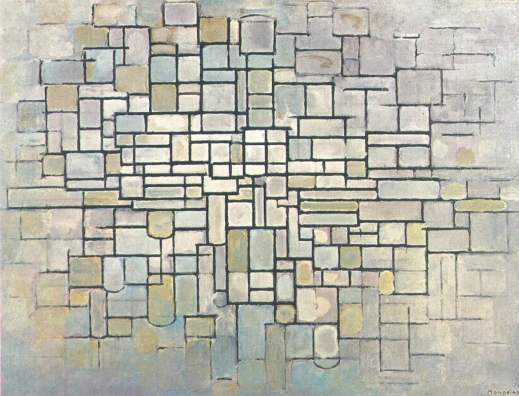
Nonetheless, if we compare Lozenge with Yellow Lines with the previous works such as those produced up to 1919:
it appears immediately obvious that the manifold aspect of the three above shown compositions had been considerably reduced almost to the point of elimination in 1933. Around 1930 Mondrian painted in black and white or with one or two colors inside predominantly white fields. In the span of a decade, the manifold space (1919) appears to have been completely absorbed by one single square in an attempt to reformulate in conceptual synthesis a space that is in reality far more structured and complex.
The square we see in Fig. 10 is a symbolic representation that does not suggest the variety of the real world. With colored lines changing also in thickness, this square alludes to multiplicity without, however, showing it in all of its far greater breadth. The variety found in the early Expressionist or Cubist works – an aspect to which the artist had always been very sensitive and which formed the starting point of his plastic explorations – was absent in 1933.

Lozenge with Yellow Lines
1933
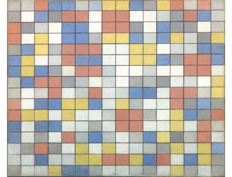
With Fig. 10 the space of external reality had undergone marked internalization in the far more condensed forms of thought; the physical seemed to be expressed in excessively mental terms. The painter was soon to realize that his canvases did not convey a sense of the variety perceived by the eye in nature or urban space, the rich and multiform aspect of color previously captured with his dunes and trees, his Cubist works, and his checkerboard compositions. While Lozenge with Four Yellow Lines can therefore be regarded as a point of arrival, at the same time, as in other moments of Mondrian’s artistic development, the work also represents a new point of departure.
As Michel Seuphor puts it in his beautiful biography of the Dutch artist: “Sometimes he thinks he has found it. So he stops, observes the work, and says: It’s done. But the clock of his life keeps on ticking and is already driving him forward. He soon realizes that nothing is done and everything has to start all over again.”
Next page: Neoplasticism – Part 4
back to overview
Copyright 1989 – 2025 Michael (Michele) Sciam All Rights Reserved More
